
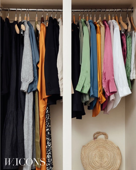
5 Ways to Choose a Patterned Pyjama Top to Elevate a Tailored Jacket
Wearing a patterned pyjama top beneath a tailored jacket can either refine an ensemble or leave it feeling mismatched, depending on the print, scale and fabric. Thoughtful choices of mood, colour and texture are what distinguish an intentionally elevated pairing from an accidental clash.
This guide distils the process into five practical steps: define the print mood, assemble a complementary colour palette, balance pattern scale with jacket proportions, harmonise fabric texture and finish, and refine the look through considered fit, tailoring and accessories. Use these steps to learn simple cues for pairing pyjama-inspired prints with tailoring so the result feels deliberate and contemporary.

1. Define the print's mood to suit the occasion
Choose the print mood by considering motif scale and contrast. Small, tonal motifs with close spacing read as texture beneath a structured jacket, while larger, higher-contrast motifs take centre stage in more relaxed or creative settings. Anchor the outfit by drawing a dominant or accent colour from the pyjama print and repeating it in the jacket lining, accessories or trousers to create cohesion without exact matching. Before you commit, check scale and placement so key motifs do not fall across shoulder seams, lapels or the chest. Control where the print appears by tucking, half-tucking or altering how the shirt is buttoned.
Ensure fabric weight and finish complement the jacket construction so the pieces move and read as one. Pair flowing, lightweight pyjamas with softened jacket silhouettes, and temper lustre with matte suiting to prevent visual competition. Test combinations in natural light and in motion: sit, walk and observe the drape from multiple angles, since prints can shift once layered beneath a jacket. Decide which element should lead the look. If the top is to be the statement, choose a high-contrast, graphic print with a pared-back jacket; if the tailoring should dominate, opt for a more subdued print. Photograph front on and at three-quarter angles, jacket open and closed, to see how the print reads and refine styling accordingly.
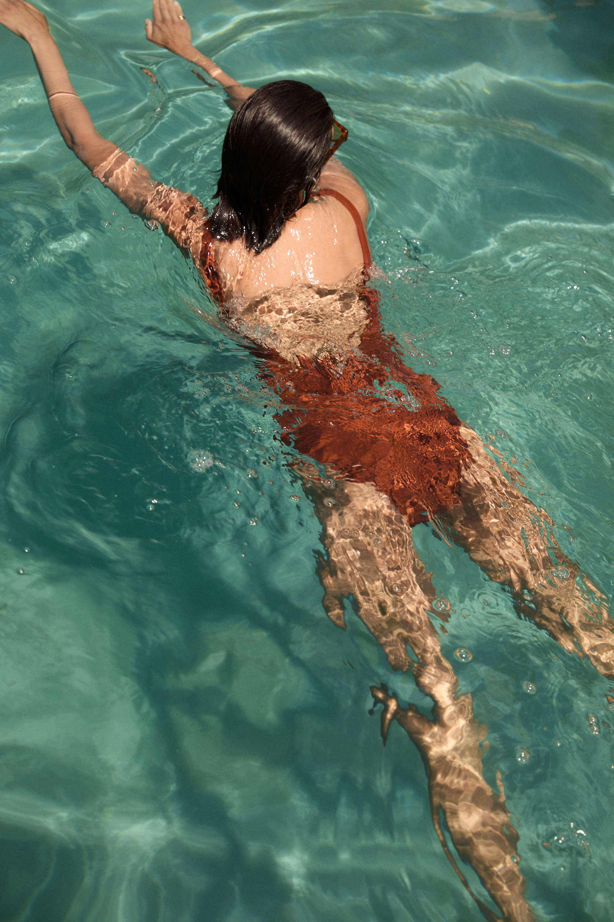
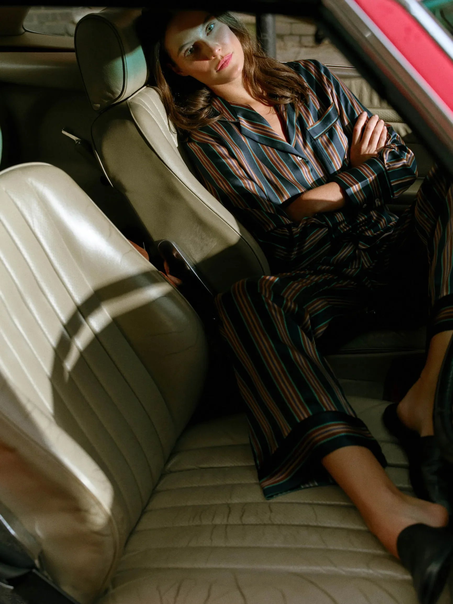
Let a bold silk print lead the outfit.

2. Build a complementary colour palette for a timeless wardrobe
Begin by extracting three swatches from the pyjama top — the dominant, the secondary and the accent — then hold each against the jacket fabric to observe their interplay. Sharing a single anchor tone between top and jacket establishes a considered visual link that reads as intentional, while keeping the remainder of the outfit cohesive. Choose a colour strategy: complementary, analogous or monochrome, and commit to that approach so the pattern either pops, sits harmoniously, or reads as a refined tonal layer.
Match or deliberately contrast value and saturation. Two garments of similar lightness will read as a single plane, while a lighter or darker pyjama top introduces depth beneath a tailored jacket. Consider fabric finish and pattern scale: silk and satin catch the light and brighten colour, whereas wool or cotton absorb it and render tones deeper. Squint at pairings or photograph them to judge perceived contrast, and view combinations in different lighting to confirm the intended effect. Keep an outfit to three or four coordinated colours, and echo an accent tone in a pocket square, stitching or lining to create cohesion without competing with the tailoring.
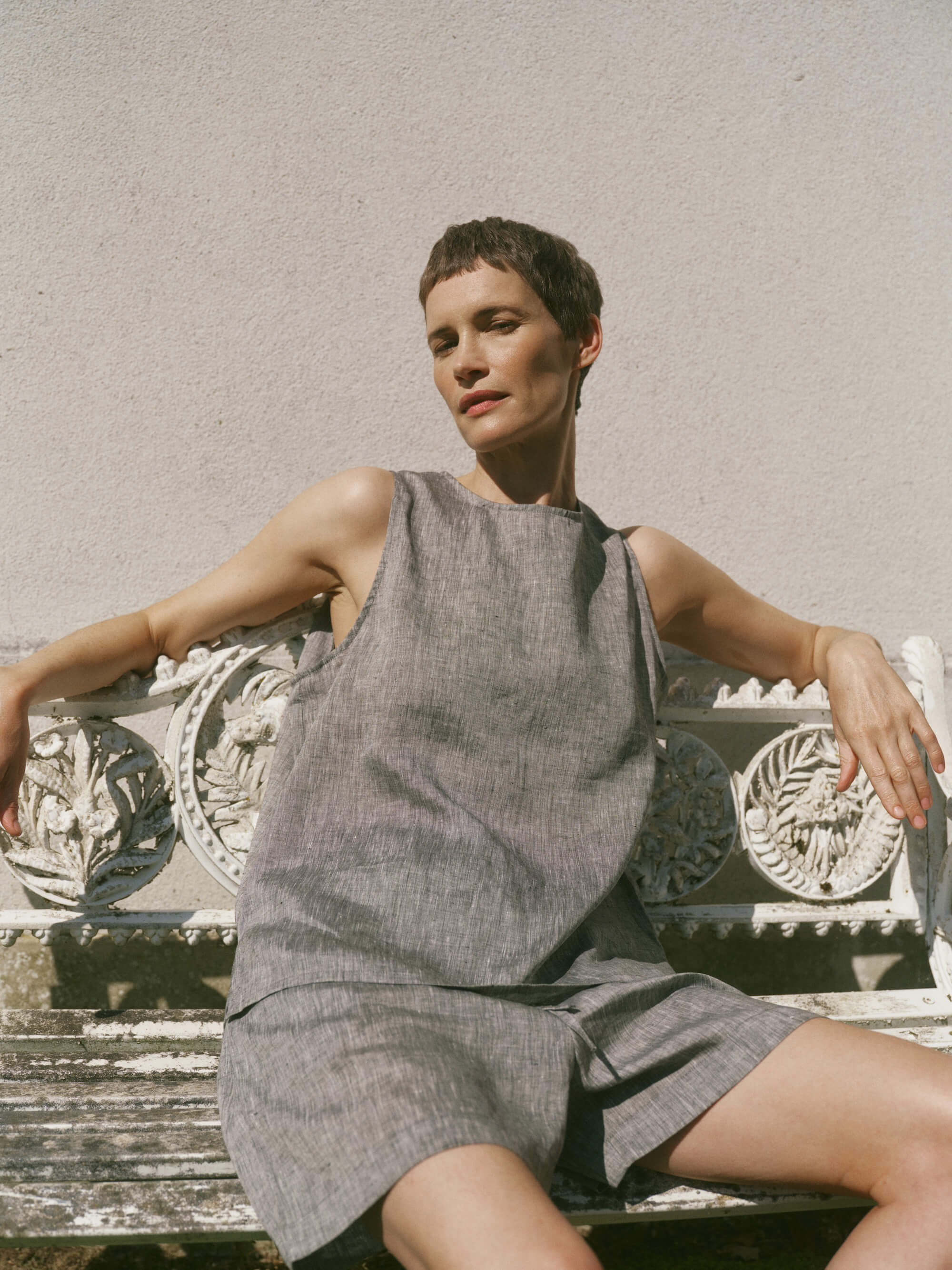
Anchor looks with a luxe silk-wool top.

3. Balance pattern scale to flatter a jacket's proportions
Balance the scale of a pyjamas top with the jacket panels so motifs remain legible. Narrow lapels, slim fronts or small panels will crop large prints into abstract shapes, while broader lapels and open fronts can accommodate painterly, large-scale motifs. Use deliberate contrast in scale to avoid visual competition: pair a bold, large-scale jacket pattern with a small, dense top to give the eye a resting point, or layer a larger top print beneath a plain or tonal jacket to create a controlled focal point. Consider the jacket silhouette and structure, as boxy, heavily structured shapes increase visual weight and suit tighter, more intricate prints, whereas fluid, unstructured jackets allow motifs to move with the fabric.
Consider how fabric behaves. Heavier suiting compresses detail, so fine prints often read as texture; by contrast, lightweight pyjama fabrics magnify scale and movement. Fasten the jacket and move to see how a pattern settles in real life. Step back a few metres to assess how a print reads at a distance, and echo a colour from the top in jacket trim, piping or a pocket square to anchor the look. Observing garments in motion and from afar will reveal whether a print should be amplified or softened.
Let lightweight cotton reveal print movement.

4. Match fabric texture and finish to your jacket for a cohesive silhouette
Begin by comparing sheen and drape in consistent light. Hold the pyjama top beside the jacket to see whether a glossy satin outshines a matte wool, and move naturally to reveal any pulling, bunching or billowing. Match fabrics of similar weight and fall so the jacket keeps its tailored silhouette; a very light, slippery top can crease or slip from beneath. Test how the fabrics interact by feeling them together, as smooth silks may slide inside a structured jacket while napped cottons or subtly textured weaves anchor more readily. If slipping persists, choose a top with more surface tooth or consider adjusting the jacket lining to control movement.
Scale prints to the jacket's texture. Reserve micro prints and delicate motifs for fine-weave suiting, and choose larger, simpler patterns or solids for tactile fabrics such as tweed or bouclé to avoid competing textures. Consider the warmth of colour and the finish of metal fastenings, as warm, brushed fabrics pair naturally with matte buttons and warm metals, while lustrous pyjama fabrics sit more comfortably with polished hardware and cooler tones. Attending to sheen, drape, texture and finish ensures the pyjama top reads as an intentional, cohesive layer beneath a tailored jacket.
Choose lightweight organic cotton for secure, non-slip layering.

5. Refine the look with considered fit, precise tailoring and timeless accessories
If a pyjama top feels overly voluminous, taper or shorten it so it sits at the hip; this prevents fabric from pooling when you sit and preserves a clean silhouette. Have jacket sleeves tailored to reveal a sliver of patterned cuff, or hem the pyjama sleeves so they rest neatly at the wrist, since a visible cuff creates a considered contrast and signals attention to detail. Introduce gentle waist definition through subtle tailoring, a slim belt, a half-tuck or by fastening a single jacket button to balance a relaxed top with a more structured shape and avoid a boxy silhouette.
Fasten the jacket so it sits smoothly over the patterned top without any gaping, and ease the pyjama top's collar neatly beneath the lapel so intersections read as intentional layering. Choose small metal or leather accents, a restrained brooch or a pocket square that echoes the print's colours and textures to link the pieces without overpowering the pattern. Press or steam both garments until edges sit crisp; this instantly elevates the look and sharpens the layering. Finish with small, considered touches that reflect the print, and allow the tailoring and neat finishes to communicate the overall refinement.
A patterned pyjama top can sharpen or unsettle tailoring depending on print mood, colour relationships, scale, and fabric finish. Test pairings in natural light, check scale in motion, and echo an anchor colour in the jacket or accessories to create cohesion without overpowering the tailoring.
Follow five practical steps: define the mood; build a cohesive palette; balance pattern scale with jacket proportions; harmonise texture and finish; and refine fit and accessories. Photograph combinations from multiple angles, make small tailoring or styling adjustments, and repeat until each outfit feels deliberate. Such attention to detail yields a composed, confident silhouette.
Leave a comment
This site is protected by hCaptcha and the hCaptcha Privacy Policy and Terms of Service apply.