
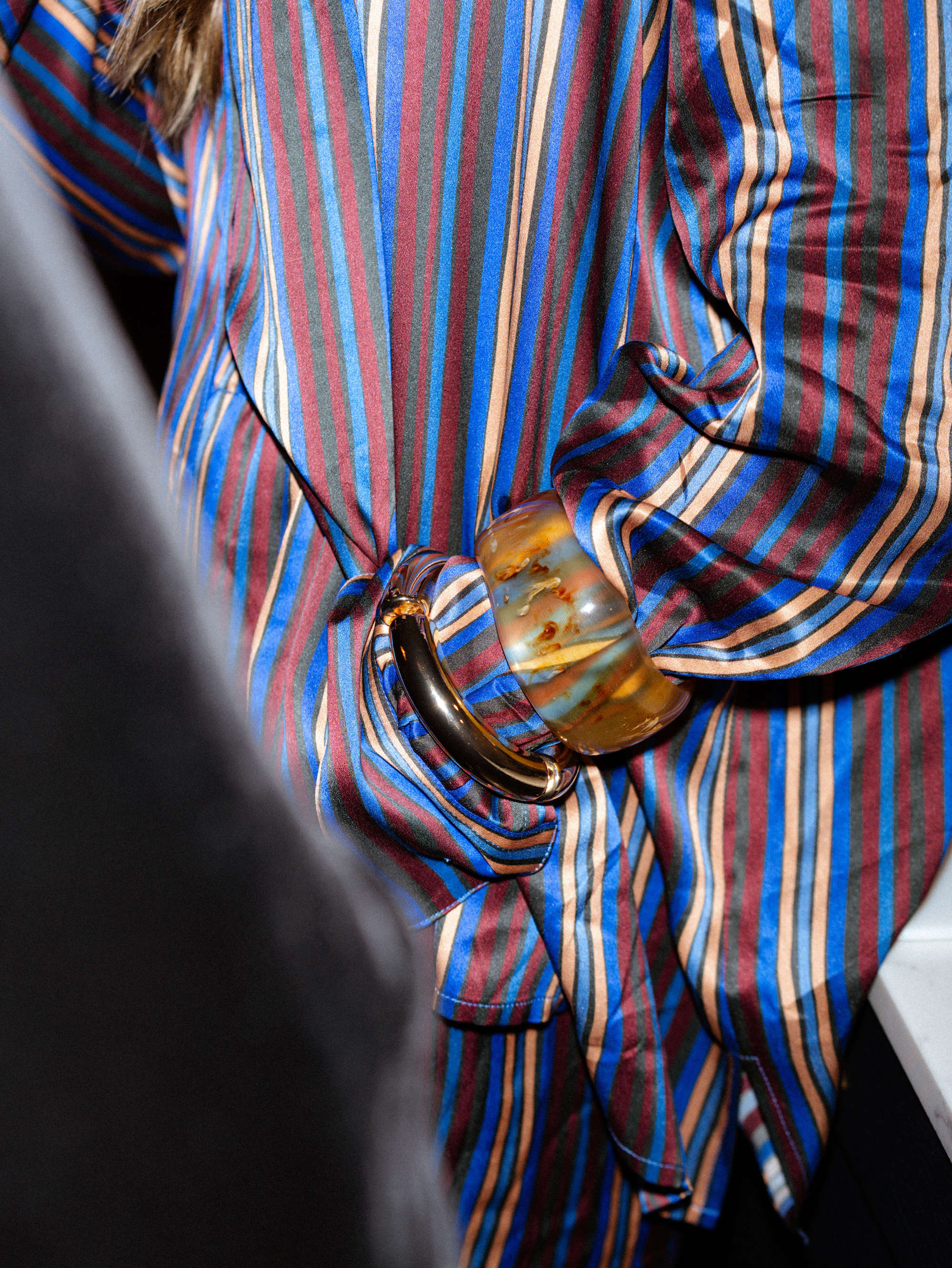
Effortlessly Pair a Printed Top with a Blazer Using the Colour Wheel
If you adore a printed top but pause when choosing a blazer that should feel considered rather than mismatched, this guide uses the colour wheel and simple harmony principles to help you pair prints with confidence.
Discover how to discern dominant, secondary and accent colours within prints, select complementary, analogous, triadic or monochromatic pairings, and consider tone, saturation and fabric texture to harmonise an outfit. Clear pairing formulas, considered outfit examples and subtle finishing touches make it simple to translate colour theory into ensembles that feel composed and modern.

Master the colour wheel to create refined colour harmonies
Begin with the colour wheel and a simple diagnostic. Step back and softly narrow your eyes to identify the print's dominant hue and whether it leans warm or cool. Then choose a blazer from the same temperature family to avoid unintended clashes; that first selection narrows the field and reduces trial and error. Use colour harmonies to refine the choice: opt for complementary colours to introduce contrast and create a focal blazer, analogous hues for a cohesive, low-contrast ensemble, or a monochromatic scheme for a refined, elongating silhouette. In every case, lower the blazer's saturation or brightness so the jacket supports the print rather than competes with it.
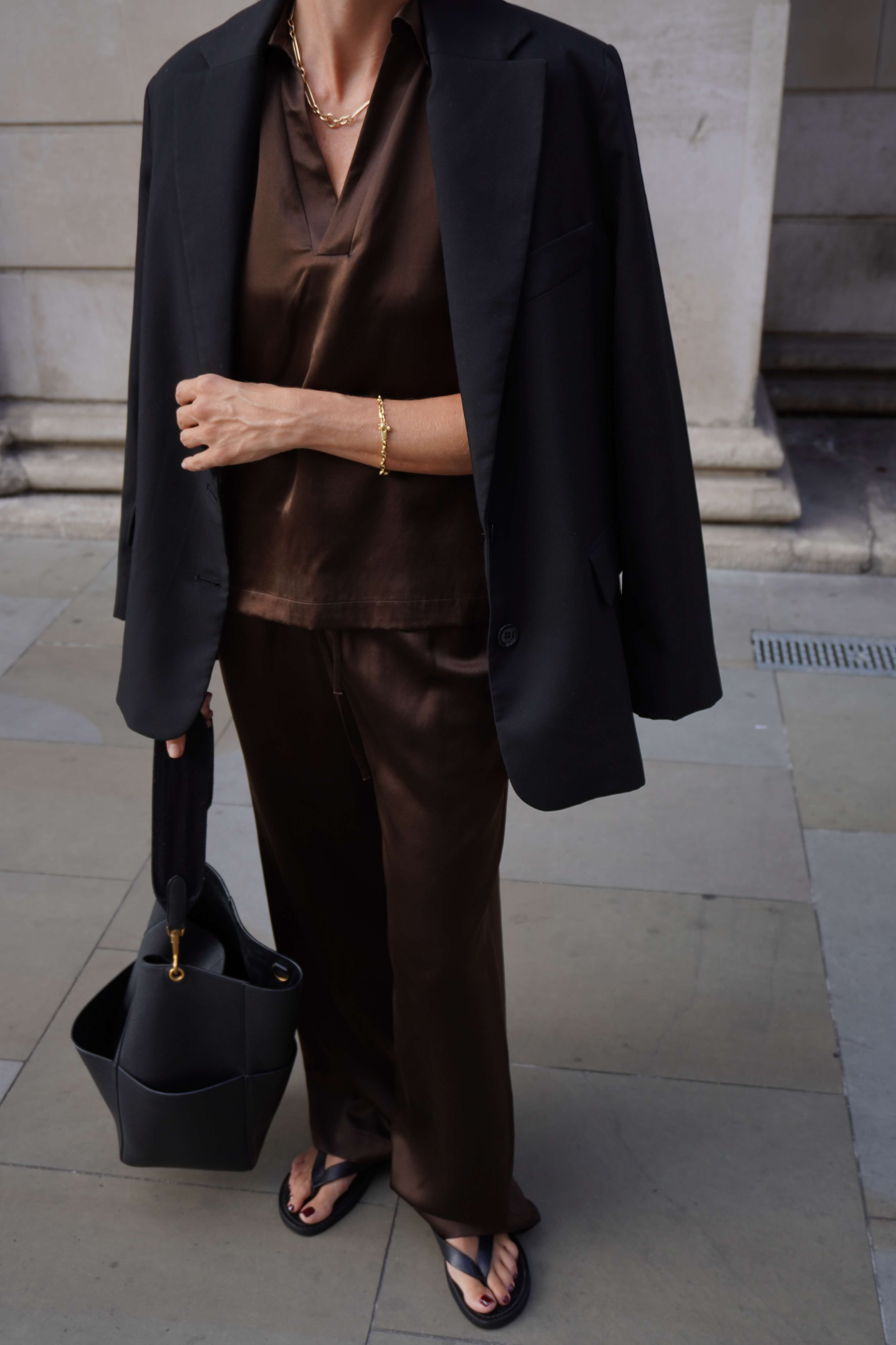
When a print carries many hues, either choose the most visually dominant colour for your blazer or calm the palette with a classic neutral such as navy, charcoal or camel. Let the print's scale and saturation inform the blazer's weight and finish: large, bold prints favour a structured, matte jacket, while small, delicate motifs work best with softer, lighter fabrics. A muted blazer tone will sit harmoniously beside a vivid print. Finish the look with considered linking details, repeating a minor accent colour in a pocket square, lining or accessory, or selecting a subtle texture that echoes the print's mood and gently guides the eye through the outfit.
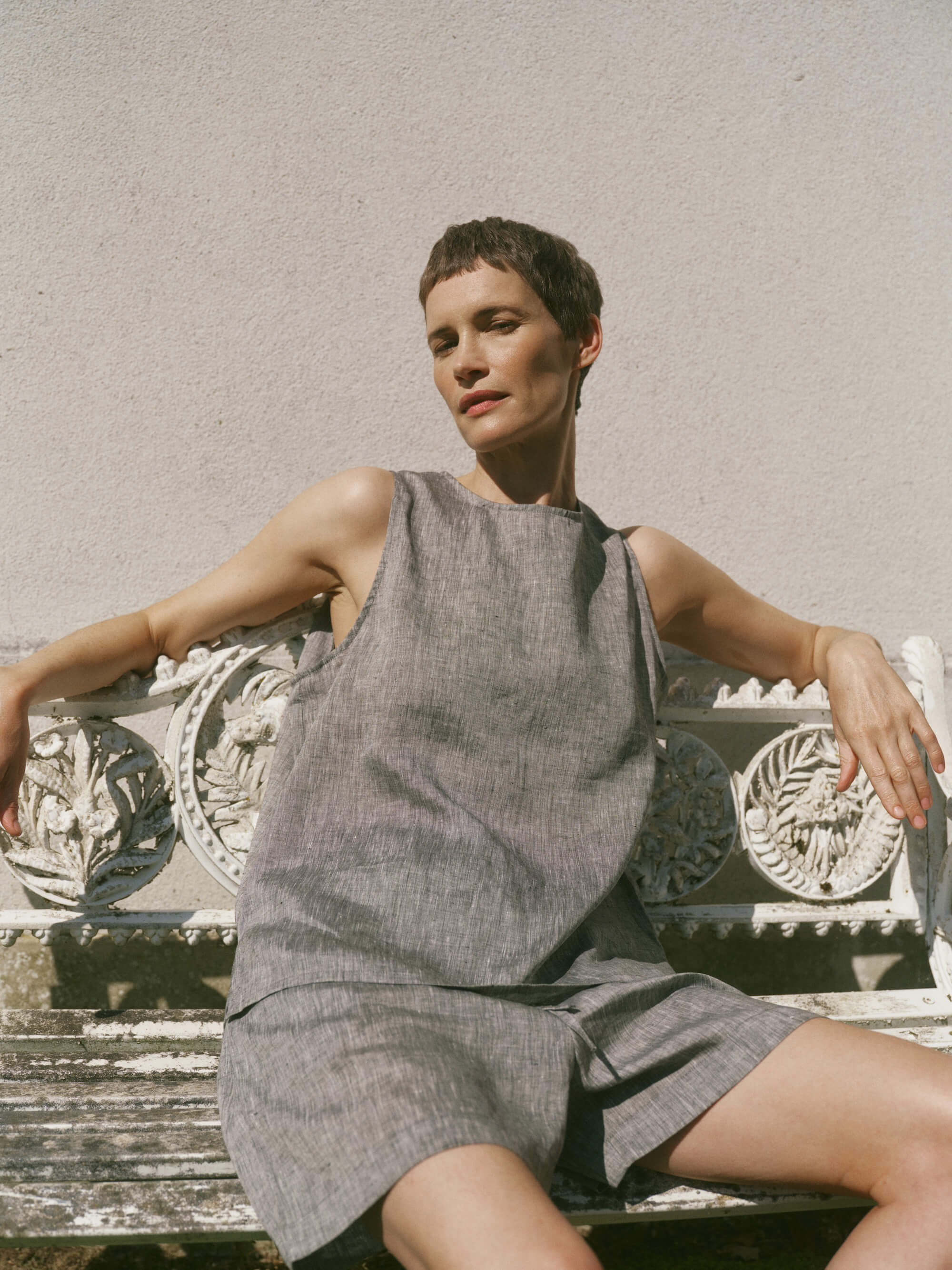
Choose a relaxed linen jacket to calm vivid prints.

Identify dominant, secondary, and accent colours in prints
Place the printed top flat and note which colour occupies the largest area as the dominant, which hues recur in the motifs as secondary, and which small pops act as accents. Take a photograph and convert it to greyscale to reveal which tones carry the most visual weight. Use the colour wheel as a guide: match a blazer to the dominant for harmonious cohesion, select a secondary hue for subtle coordination, or choose a complementary or triadic colour for considered contrast. Commit to one of these approaches so the outfit reads with a single, calm focal logic rather than competing points of interest.
Match the blazer to the scale of the print. Tiny, dense motifs read as texture and can be paired with patterned or tonal blazers, while larger motifs need a plain, single colour blazer to anchor the outfit. When a print contains several colours, select one printed hue for the blazer to simplify the ensemble. Compare undertones and saturation in natural daylight by holding the blazer fabric next to the top; if one looks washed out or overly vivid, choose a blazer with a closer undertone match or opt for a neutral that balances both. Bridge any remaining gaps with accessories that echo the print's accent colour, and ensure the blazer's cut and proportions complement rather than compete with the top.
Anchor prints with a dust-blue silk layer.

How to choose blazer colours with complementary, analogous, triadic and monochromatic pairings
Photograph the printed top in soft, natural light. From the image, identify three colours: a dominant shade, a secondary tone and a small accent. These three targets make selecting a blazer precise and repeatable. Choose a blazer in the dominant or secondary hue, matched at a similar value (that is, comparable lightness) so it anchors the outfit rather than competing with the print. Alternatively, consult the colour wheel: pick the opposite hue for complementary contrast, a neighbouring hue for analogous harmony, a triadic point for balanced vibrancy, or adopt a monochromatic approach by varying the same colour's shade and saturation. Use accessories in the remaining triadic points or the accent colour to link pieces subtly and keep the overall look cohesive.
Consider value and contrast as your first guide: a blazer several shades darker or lighter creates a deliberate separation that draws the eye, while closely matched values feel cohesive and calm. Match fabric finish and scale with care: glossy prints sit well against smoother, more fluid blazers, while textured prints pair best with matt or structured cloth. Small-scale prints are complemented by tailored cuts; large-scale motifs work better with softer, less structured silhouettes to avoid visual overcrowding. If a pairing feels uncertain, introduce a pocket square, scarf or shoe in the accent colour, tweak sleeve length or lapel width, then view the combination in different light to correct any unwanted cool or warm shifts.
Practical steps for pairing a blazer with a printed top
- Quick colour picking workflow: Photograph the top in natural light against a neutral background, avoid flash, and capture a full frame of the print. Open the image in an editor, sample a broad area for the dominant colour, a mid‑coverage area for the secondary colour, and a small saturated spot for the accent. Record their colour values and use the dominant or secondary hue at a similar value for a blazer to anchor the outfit, or refer to the colour wheel choices below when you want a deliberate contrast.
- Pairing cheat sheet by print type: Small scale prints work best with tailored, matt blazers in neighbouring or tonal hues; bold geometric prints suit a structured blazer in a complementary or triadic colour at a contrasting value; metallic or shiny prints call for a smooth, low sheen blazer in a muted or analogous hue to avoid visual competition; large painterly or abstract prints benefit from softer, less structured blazers in a tonal or analogous palette to give the print room to breathe. Match scale to silhouette: small prints to tailored cuts, large prints to relaxed shapes.
- Colour wheel tactics and value rules: For complementary contrast pick the opposite hue, for analogous harmony pick a neighbouring hue, for triadic balance pick one of the three evenly spaced points, and for monochrome vary shade and saturation of the same hue. Prioritise value: a blazer several shades darker or lighter will create separation and draw the eye, while closely matched values unify the look.
- Troubleshooting and finishing touches: Rescue borderline matches with accessories in the accent or remaining triadic colours, such as a pocket square, scarf, or shoes. Tweak sleeve length or lapel width to adjust perceived scale, and check the pairing under different light to detect warm or cool shifts. Use fabric finish to reconcile clashes, favouring matt structured pieces for textured prints and smoother finishes for shiny prints, and prefer linking with accessories before replacing main pieces.

How to adjust tone, saturation and fabric texture for your print
Begin by discerning the print's dominant hue, then note the secondary tones and whether the overall cast feels warm or cool. Capture a phone photograph and use a colour-picker app, or simply squint to distil the palette. Consult the colour wheel to explore complementary, analogous or triadic pairings. Balance intensity by pairing a vivid, high-saturation print with a lower-saturation blazer, or by matching saturation across pieces for a cohesive, confident look. For tonal blends, select a blazer one or two shades lighter or darker within the same hue to introduce depth without competing with the print.
Balance print scale by pairing a large, graphic print with a plain or very subtly patterned blazer so the motif can breathe. Conversely, a small ditsy print sits beautifully against textured fabrics or micro-patterns to create a considered visual hierarchy. Match lightweight, glossy tops with matte, structured blazers to stabilise the drape and prevent slippage, and counter heavy, saturated prints with denser weaves for proportional harmony. Always view combinations in natural light and in a photograph taken at arm's length to judge how colours read at a distance and whether the blazer picks up a secondary colour or neutral from the print. Finish by quietly echoing a print tone in a pocket square, lining or top layer, and refine collar shapes and sleeve lengths so the garment proportions remain consistent with the print's scale.
Choose a lightweight printed silk for effortless coordinated layering.
Style pairings: outfit examples and refined finishing touches
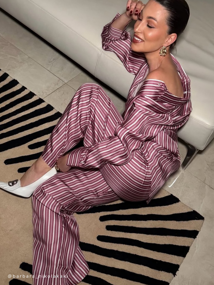
Use the colour wheel to pair printed tops with blazers through five reliable formulas: complementary, analogous, triadic, split-complementary and monochrome. Each approach offers a distinct effect — complementary pairings increase contrast and boldness, triadic combinations feel lively yet balanced, analogous schemes read harmonious and calm, split-complementary moderates contrast, and monochrome keeps the result subtle and refined. Practical examples make each formula easier to imagine. For complementary, try a teal floral top with a coral blazer. For a triadic look, choose a blouse that features three evenly spaced hues and pair it with a blazer in one of those shades. A simple, step by step method helps you compose the outfit: identify the dominant, secondary and accent colours in the print; decide whether you want harmony or contrast; then select a blazer to match the dominant for cohesion, pick an accent for a deliberate pop, or choose a neutral to anchor the ensemble. A quick way to check undertones is to hold the blazer next to the print in natural light. Scale, pattern and proportion are as important as colour. Balance a large, busy print with a simple, structured blazer to maintain sophistication. Conversely, pair small, dense prints with a blazer that has subtle texture or a minimal pattern to avoid visual muddiness. One outfit example for each scenario will illustrate how scale influences perceived neatness and formality.
Finishing touches bring an outfit into harmonious balance. Choose one small colour from the print to echo in a single accessory, select shoe and belt tones that either elongate the silhouette or ground the look, and match the metal of your jewellery to the print’s warm or cool undertones. As a simple rule, repeat only one printed colour in one accessory and keep other accents neutral. Practical checks help avoid common mistakes: view the outfit in natural light and take a photo to spot any colour clashes; if the pairing feels too busy, swap the blazer for a mid-tone neutral; or use a single-colour swatch or scarf as a quick litmus test before you commit. A short troubleshooting checklist links contrast to occasion: raise contrast for relaxed daytime looks, soften it for smart-casual, and anchor smarter settings with a neutral blazer and restrained accessories.
Use the colour wheel to read a print: choose a dominant hue, a secondary tone and a small accent, and let colour harmony principles such as complementary, analogous, triadic or monochrome inform your blazer choice. Consider tonal value, saturation, pattern scale and fabric finish so the blazer complements the print rather than competes with it, and echo the accent in a finely chosen accessory to tie the look together.
Learn to read the colour wheel by identifying a dominant hue, a supporting secondary shade and a single accent. Consider tone, saturation and texture as your guide to quicker decisions, testing combinations in natural light and photographing them at arm's length to capture true colour. Apply five simple pairing formulas to build confident, repeatable outfits that make dressing feel purposeful and effortless.

Leave a comment
This site is protected by hCaptcha and the hCaptcha Privacy Policy and Terms of Service apply.