
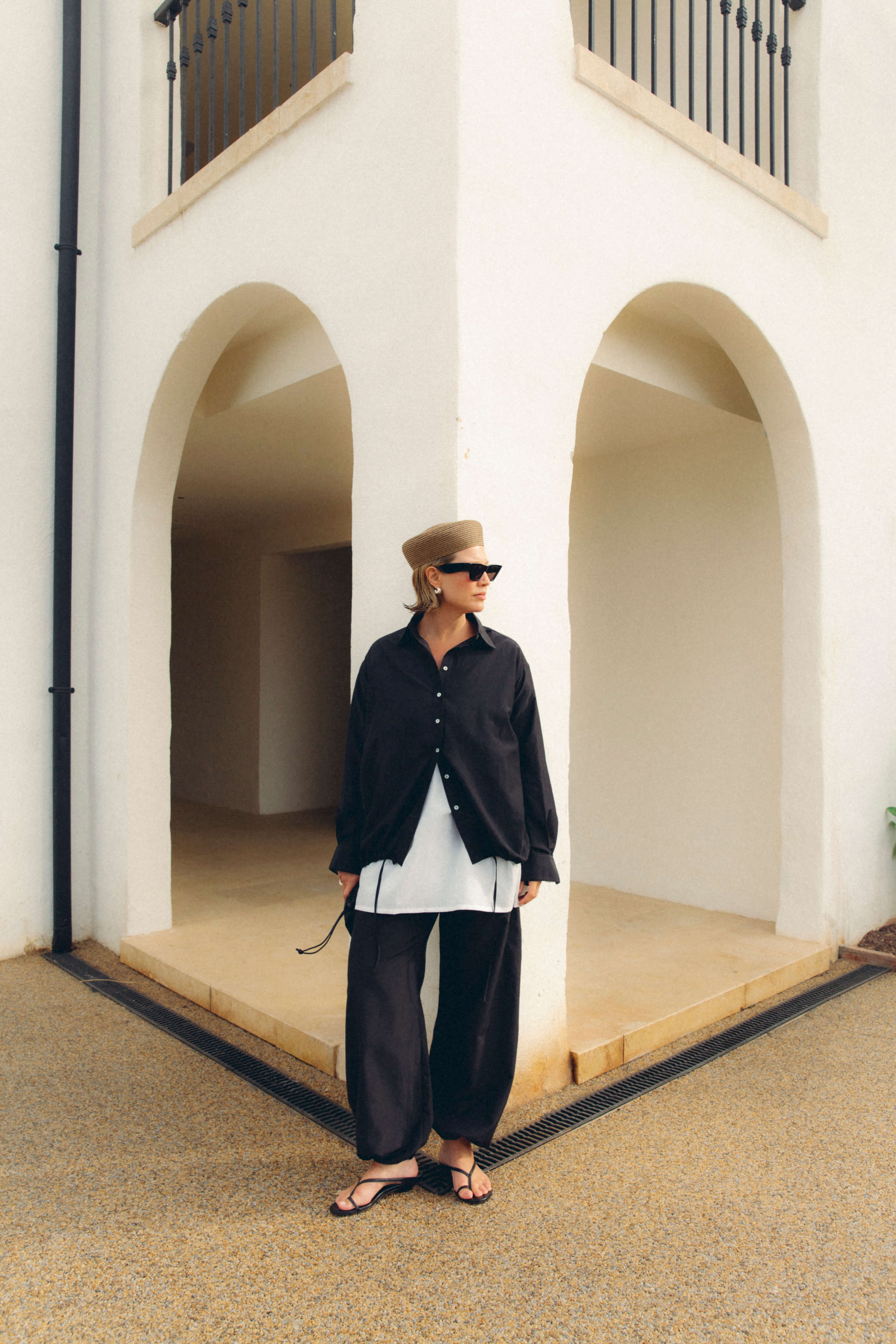

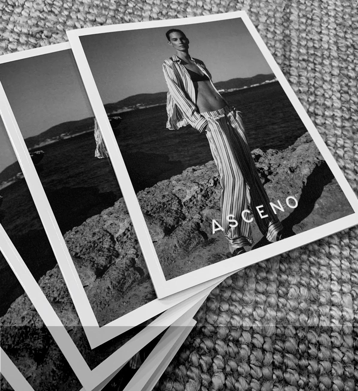
Flatter Every Shot by Choosing Print Sizes That Read Clearly on Camera
A bold print can be breathtaking in person, yet on camera it may read as visual clutter, resolve into indistinct dots or produce moire patterns. Selecting the right print scale, contrast and repeat complexity, and testing how a fabric drapes and moves, are as important as lighting in achieving a flattering photograph.
This post sets out practical, photography-focused checks to help you select prints: scale motifs to shooting distance, prioritise contrast and colour, limit pattern complexity, assess fabric drape and movement and harmonise styling, proportions and backgrounds. Apply these checks to ensure prints read clearly on camera and flatter every frame.

How to scale prints to optimise shooting distance
Mark the camera position and take a controlled test shot from the intended distance. Inspect the image at the final output size or at a 100% crop to confirm that fine detail and any text remain legible. Include a reference object of known dimensions, or a line of standard text, in the frame so you can calculate the proportion of frame height the print occupies, and record that figure for later shoots. If edges appear soft or characters are difficult to read, increase the print size, move the camera closer, or adjust the framing and repeat the test until the text is sharp and clear.
When photographing prints, keep the print plane parallel to the camera sensor and use a spirit level to avoid foreshortening, which reduces the readable area. If you must shoot from an angle, compensate by making the print occupy more of the frame or by moving closer, and double-check composition with a test shot. Work with depth of field, focal length and lighting together. Stop down the aperture to ensure the whole print remains sharp, choose a focal length that gives the print a considered presence in the frame, and light it evenly to preserve contrast and texture. Always review 100% crops to confirm that texture and edges remain distinct under your chosen settings. Use mounting and negative space as compositional tools. A wider mat or border will make the image read larger and provide breathing room; during your distance trials test different border widths to discover which improves legibility and overall visual impact.
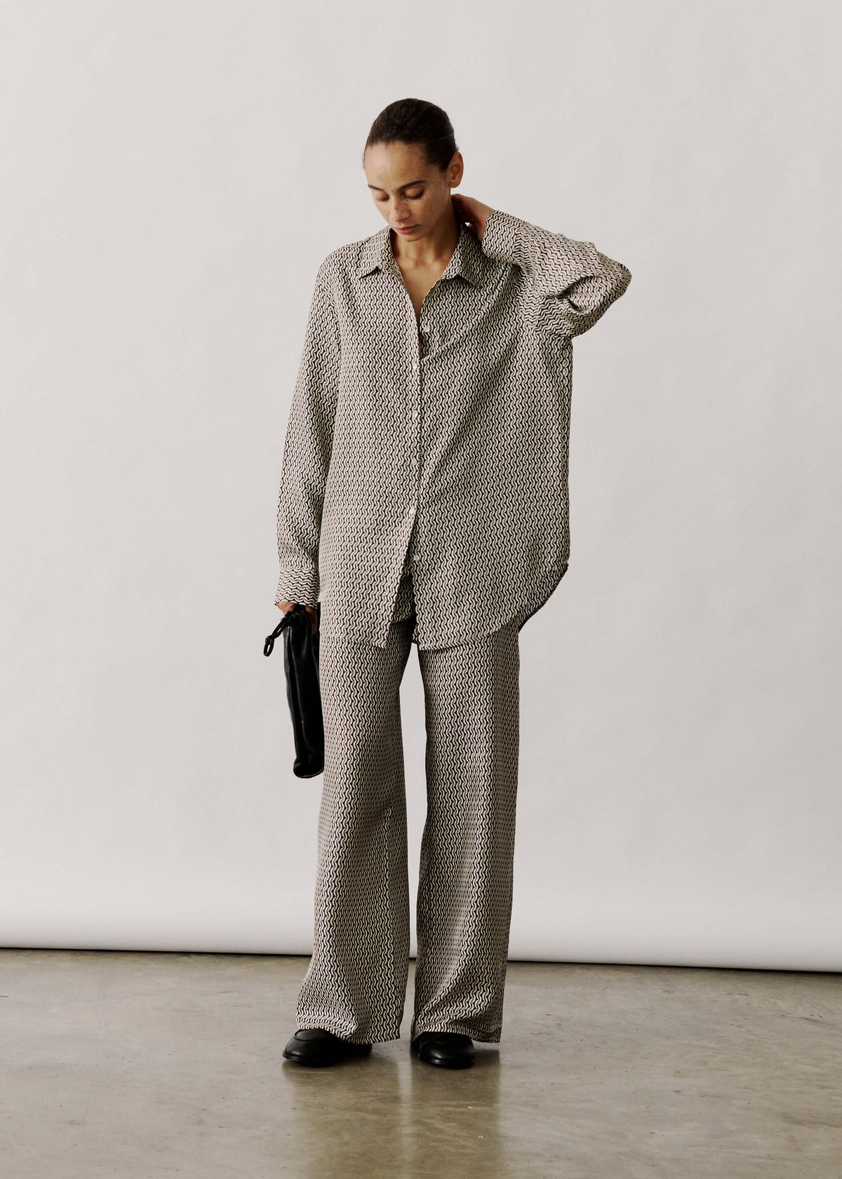
Use bold printed silk to test texture and detail.

Prioritise contrast and colour to enhance image clarity
To assess how type will render on camera, print a sample at the exact size it will occupy in the frame. Photograph that print with the camera and lens you intend to use, then view the image at the final display size so you can judge how counters and edges render after capture and compression. If fine details or thin strokes blur, increase the point size, font weight and letter spacing until characters remain distinct at the target resolution. Use matt papers and inks to reduce reflections, light the printed area evenly to avoid hotspots and underexposure, and rephotograph after any printing or lighting adjustment to confirm readability.
Prioritise luminance contrast over hue, aiming for at least a 4.5:1 ratio for small type and 3:1 for larger type so characters retain their shape through camera processing and compression. Choose plain, open typefaces with generous x-heights and steer clear of fine serifs and hairline strokes. Increase tracking slightly for dense copy to keep letterforms distinct. Use narrow strokes or a solid background panel to separate text from busy imagery, and favour mid-saturated colours with clear lightness differences rather than relying on hue alone. Verify legibility by viewing designs in greyscale and under simulated colour-blind conditions, and avoid highly saturated reds and blues that some sensors may clip.
Choose matte, high-contrast fabrics for camera clarity

Keep pattern complexity minimal and choose clear repeats
Carry out an on-set camera test using the intended framing and lighting. Examine images at 100 per cent and at the final delivery resolution, and change garments until motifs remain distinct and free from wavy or rainbow moiré artefacts in playback. Match the repeat scale to the shot: for head-and-shoulders compositions, select motifs at least the size of an ear so they read as shapes; three-quarter and full-length frames can allow denser repeats. Use this visual scale test rather than arbitrary centimetre rules. Opt for lower-contrast, tonal repeats instead of tiny, high-contrast geometry, as fine stripes and micro-checks often interact with sensor sampling to create interference; softer contrast reads as texture on camera.
When combining patterns, favour one dominant scale with a quieter companion, or pair a busy print with a solid or a very large-scale motif to preserve focal hierarchy and ensure the viewer’s eye remains on the face. Use the direction and placement of patterns to flatter the subject: vertical or long diagonal repeats lengthen the silhouette, curved motifs soften features, and placing large motifs below the chest or slightly off-centre helps avoid drawing attention away from the eyes. Always test combinations on camera at final resolution so garments read clearly and support the intended composition.
On-set pattern testing and styling checklist
- Run a framed lighting test: photograph the talent at the intended framing and lighting, review images at 100 per cent and at the final delivery resolution, introduce the expected camera and subject motion, and swap garments until motifs remain distinct and show no wavy or rainbow moiré artefacts on playback. Pass criteria: motif edges read as shapes at delivery resolution and no temporal interference appears during motion.
- Match repeat scale to shot size: for head-and-shoulders choose motifs at least the size of an ear so they read as shapes; in three-quarter and full-length shots permit denser repeats. Use this visual scale test rather than fixed measurements, and favour lower-contrast, tonal repeats over tiny, high-contrast geometry that tends to create interference with sensor sampling.
- When mixing patterns, keep one dominant scale and one subdued scale, or pair a busy print with a solid or a very large-scale motif to preserve focal hierarchy. Use vertical or long diagonal repeats to lengthen the silhouette, curved motifs to soften features, and locate large motifs below the chest or off-centre to avoid drawing attention from the eyes. Test each combination on camera at final resolution.
- Understand and mitigate moiré: fine, high-contrast repeats can interact with sensor sampling to create interference. Mitigate by choosing softer-contrast prints, altering distance or lens focal length to change sampling frequency, adjusting focus or aperture slightly, reducing camera or subject motion, rotating the fabric, or swapping the garment. If necessary, apply selective spatial smoothing or temporal denoising in postproduction, but prioritise preventive choices at wardrobe.

How to test fabric drape and movement on camera
Record short video clips at the exact camera distance and framing you intend to use, with the subject walking, turning and sitting. Play back individual frames at the final crop to analyse whether fine prints resolve, produce moiré or shimmer, or blur into texture, and whether bold prints distract from the face and other key features. Test fabrics under the same lighting conditions you will use, including back light and side light. Check for translucency, sheen and highlight hot spots, since a high sheen can wash out a print while a matte finish preserves pattern contrast and edge definition.
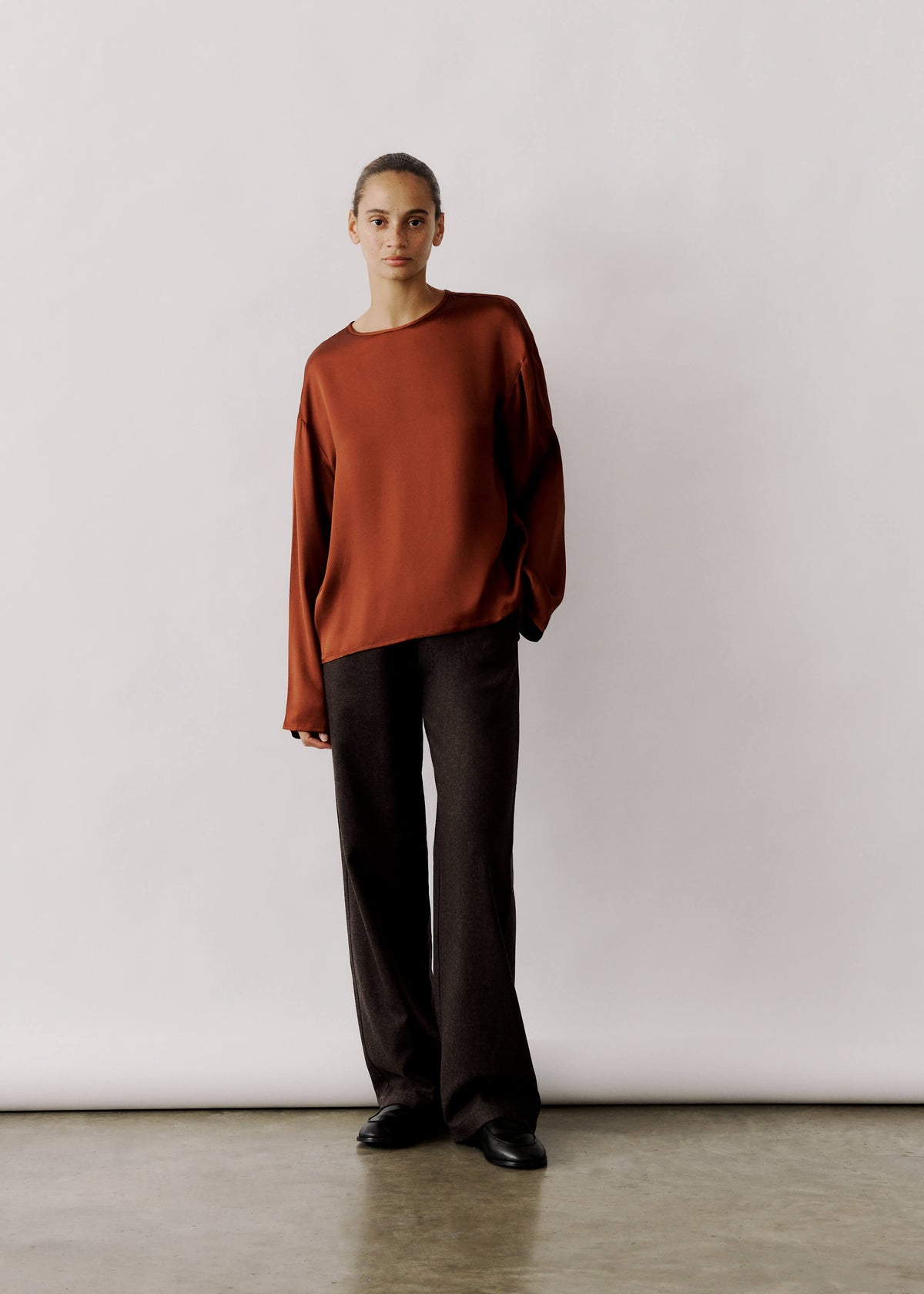
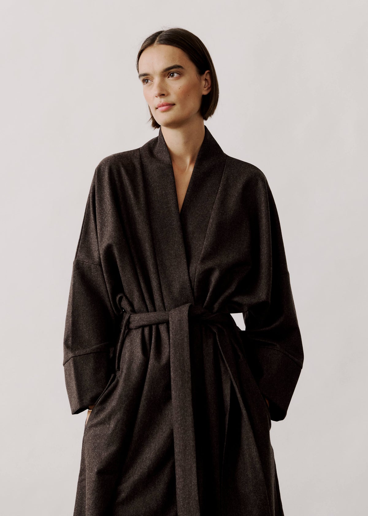
Pin or drape full-size swatches on a mannequin or a colleague and photograph them at a range of focal lengths to observe how wide-angle perspectives exaggerate distortion and movement, while longer lenses compress scale and can make prints read smaller. Compare drape and motion using both handheld footage and stabilised tripod shots; heavier, more structured fabrics tend to retain print clarity in movement, whereas lightweight, airy fabrics may blur or fragment a pattern. Create full-body mock-ups with scaled print placements and photograph them at the intended shot size to assess balance and focal points. Refine print scale and placement until the pattern flatters the body and does not compete with the subject's face, hands or other points of focus.
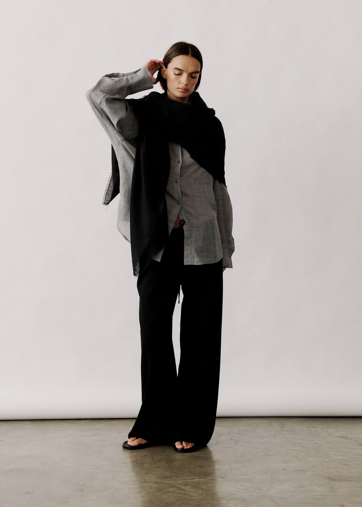
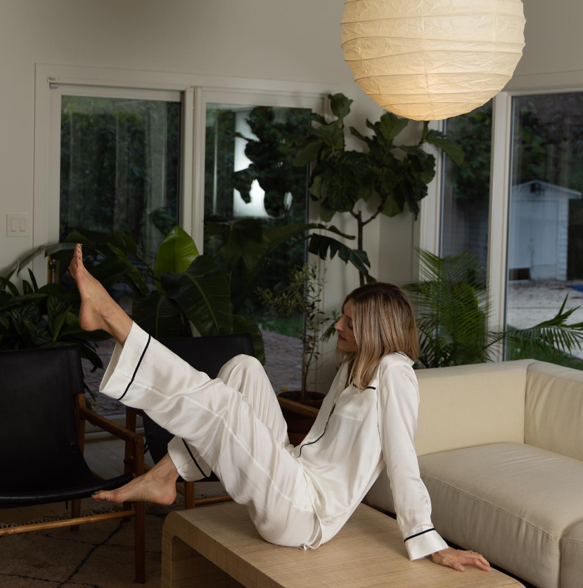
Use heavier-weight linen to preserve print clarity.

How to balance styling, proportions and backgrounds to flatter prints
Run a quick mock-up by producing or cropping one sample image at each candidate print size. Mount each sample where you will shoot, then photograph them from the exact camera position and framing you intend to use. Review the resulting photographs at the final display size to identify the smallest print that still preserves detail and readable text. Photographing the samples will expose the point at which legibility fails in real conditions, allowing you to select the minimum effective size with confidence. Match print scale to the subject and frame proportions: compose using the rule of thirds or a centred focus, keep margins consistent, and consider adding a mat or border to increase perceived size without altering the actual dimensions.
Place small or detailed prints against smooth, low-contrast surfaces to preserve legibility, and reserve patterned or heavily textured backgrounds for larger pieces. Photograph samples side by side to judge how local texture competes with the print. Use broad, diffused lighting to avoid specular highlights, tilt the subject slightly to reduce reflections, and select a smaller aperture to increase depth of field so the whole surface remains in focus. Compose groups and props to establish a clear visual hierarchy: choose a dominant print, keep secondary pieces and surrounding objects in proportion, and test several groupings from your shooting position to see which composition reads most clearly on camera.
Ensure each shot flatters its subject by choosing print scale and contrast that read clearly at the camera distance you plan to use, verified with controlled test shots and 100% crops. Thoughtful scaling, restrained repeat complexity, and testing of drape and movement, together with careful adjustment of lighting and background, will reveal how patterns and fabrics register as shape, texture or noise in the final images.
Work methodically through these checks: scale relative to shooting distance; prioritise contrast and colour; limit the complexity of repeats; assess drape and movement; and balance styling with the background. Photograph each setup at the intended framing and final crop, then review the 100 percent crops to select the simplest, clearest print solution that consistently flatters the subject.


Leave a comment
This site is protected by hCaptcha and the hCaptcha Privacy Policy and Terms of Service apply.