
How to Mix Colours and Textures Across Accessories for a Cohesive Look
Have you ever assembled an outfit only to discover the accessories seem to belong to different wardrobes? Balancing colour and texture across jewellery, bags and belts can quickly feel like a guessing game.
This post outlines simple rules for colour and texture, demonstrates how to harmonise metals, leathers and textiles, and explains how to transition accessories from refined resort dressing to city looks. Apply a few practical guidelines and modest pairings, for example echoing a metal tone or repeating a texture, to create cohesive, considered outfits with ease and without fuss.

Styling accessories with colour and texture rules for effortless elegance
Adopt a three-tier colour system: choose a dominant colour for large surfaces, a secondary for mid-sized pieces and one or two accents for smaller accessories, then distribute those accents around the room so they recur and form subtle visual links. Introduce texture to add depth by pairing smooth, reflective materials such as glass or polished metal with soft, matte textiles like wool, linen or velvet, and repeat at least one texture across different accessories to unify the scheme. Balance scale and weight by combining generous, low-lying elements such as rugs and throws with smaller, lighter objects like ceramics and candles, and group items in odd numbers to establish a measured rhythm without clutter.
Introduce a single metallic or glossy accent against muted, tactile surfaces to create a defined focal point, and use warm and cool tones sparingly to add subtle interest while maintaining overall harmony. Test colours and textures in the actual space by placing fabric swatches and accessory samples where they will live, and observe how sheen and shadow shift perception under different lighting. Adjust placement until accent colours recur across the room and textures reappear at varying scales, encouraging the eye to travel and giving the arrangement a considered, intentional feel.
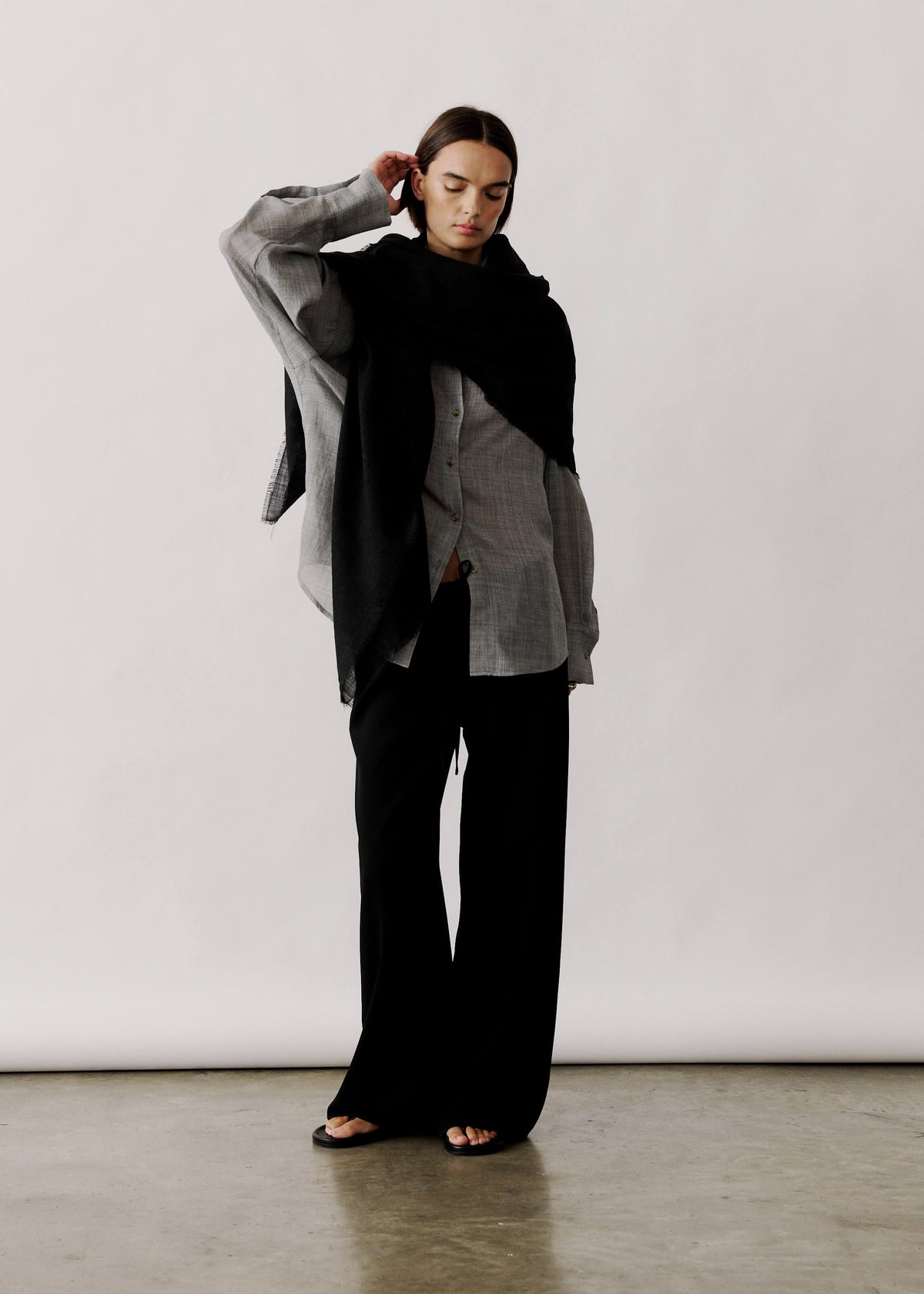
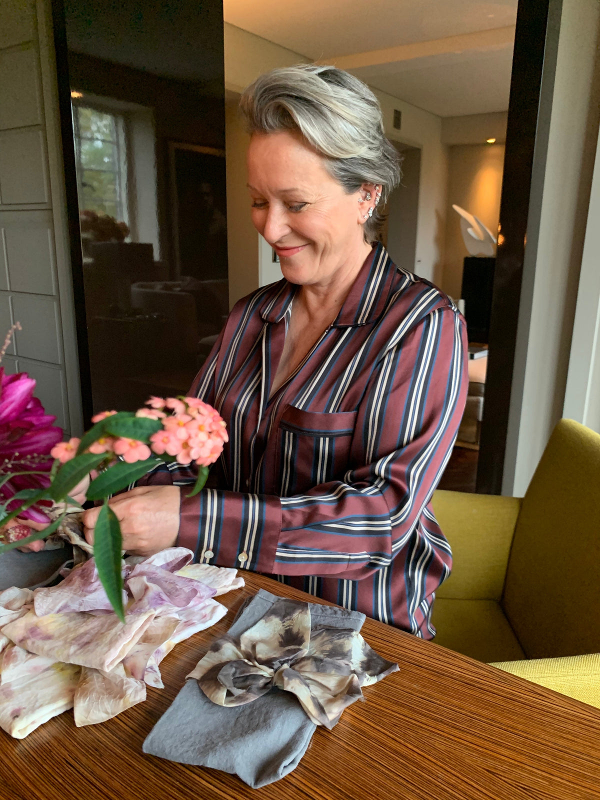
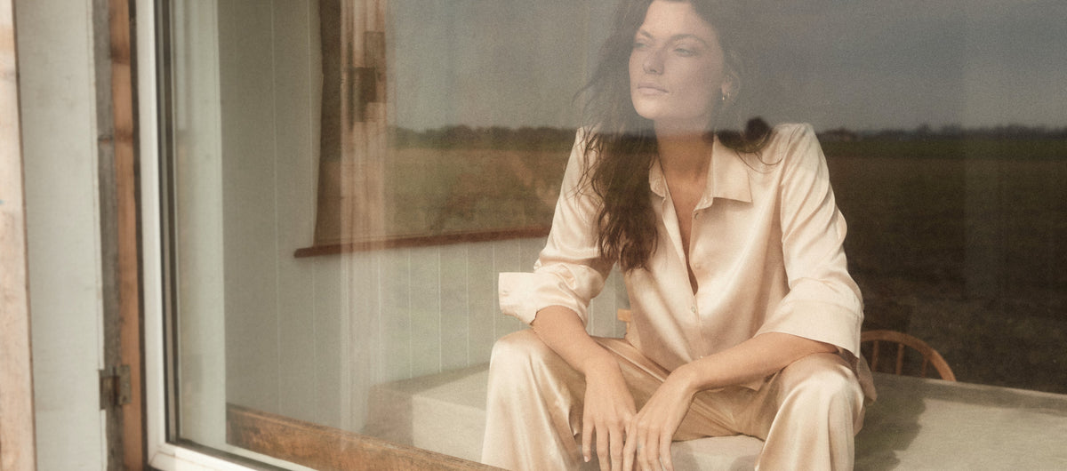
Drape dust-blue silk to add sheen and soft texture

Harmonise metals, leathers and textiles for a cohesive accessories edit
Select a single metal tone and carry it through rings, necklaces, bag hardware and belt buckles to create visual continuity and quiet the overall palette. Match textures with intent: pair smooth, polished leathers with glossy jewellery finishes, and suede or brushed leathers with matte or oxidised metals so the finishes feel cohesive without requiring identical colours. Keep the material palette to two or three elements, and repeat one element in at least three places, for example a warm metal, tan leather and a knitted scarf, to establish rhythm and a focal point.
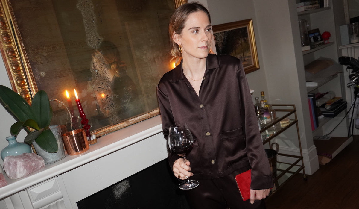
Choose a single accent colour drawn from a print or garment, and echo it in a bag strap, belt stitching or a piece of jewellery so the eye travels through the outfit. View combinations in natural light and while moving, since scale, weight and sheen read differently in motion. If something feels off, swap a chunky bracelet for a slender cuff, or a wide belt for a narrow one, and observe how proportion and movement alter the composition. These small edits reveal which elements anchor the look and which create distraction, allowing you to pare back to a cohesive whole.
Anchor accessories to the dress’s printed bronze accent.

Transition accessories from refined resort wear to city looks
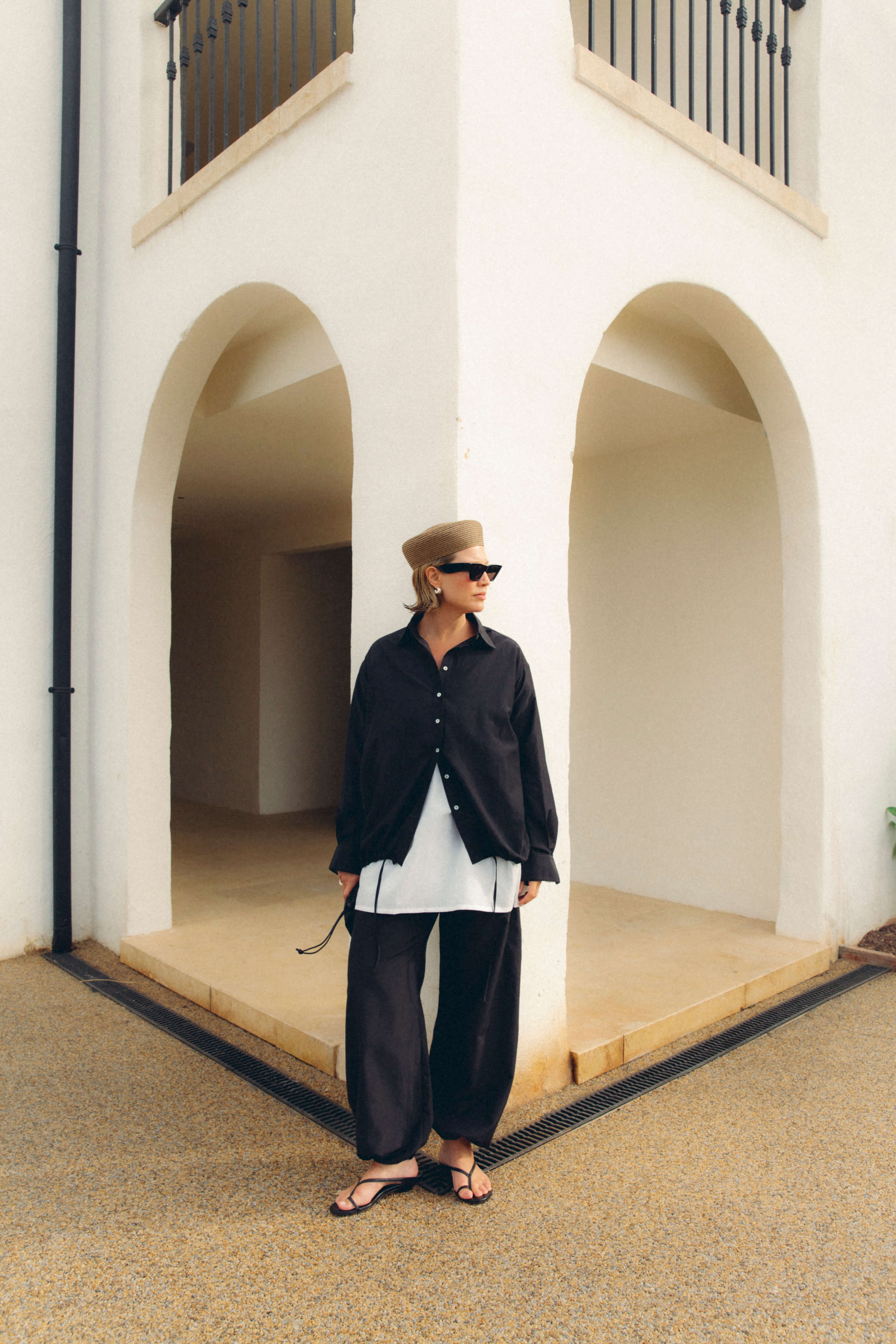
Create a cohesive accessory story using a 60:30:10 approach: select a dominant neutral for your bag and shoes, a secondary colour for hats and scarves, and a bright accent in jewellery or a belt. Repeat that accent across different materials so the eye reads an intentional link as textures move between resort and city looks. Keep colour families consistent while varying finishes, such as raffia or matte surfaces against smooth leather or polished metal, to signal a subtle shift in formality without disrupting continuity. Anchor mixed materials by choosing a single metal tone for clasps, buckles, watch trim and primary jewellery.
Balance scale and visual weight to direct the eye: pair a chunky, textured shoe or bag with delicate, layered jewellery and a lightweight scarf. For city dressing, reverse the balance with sleeker footwear and a single statement piece. Introduce one contrasting metal in small doses so the metalwork reads intentional rather than accidental. Treat versatile pieces as transformation tools: a printed silk scarf becomes a head wrap or sarong for holiday, then a neat neck scarf or handle wrap for daywear. Swap a straw tote for a structured crossbody while keeping the same scarf and a matching belt to alter silhouette and perceived formality, yet retain a coherent colour and design thread.
Considered accessory styling depends on the deliberate repetition of colour, texture and metal. Work within a simple three-tier colour system and carry at least one texture through multiple pieces to guide the eye. Aim for harmony in scale and sheen, and assess swatches and samples in natural daylight to discern which elements anchor an outfit and which create distraction.
Use practical techniques such as harmonising metals and leathers, echoing an accent colour and adopting a 60:30:10 split to transition smoothly between holiday and city outfits while maintaining a coherent thread. Begin by selecting a dominant metal tone and a single accent to repeat, then make subtle adjustments in proportion and movement until the overall composition feels purposeful and considered.

Leave a comment
This site is protected by hCaptcha and the hCaptcha Privacy Policy and Terms of Service apply.