
5 Blazer Colours That Elevate a Printed Pyjama Set
Wearing a printed pyjama set beyond the bedroom can read as either a relaxed, elegant statement or an unintended misstep. Which blazer colours complement a lively print without overwhelming it, and how do fabric, cut and accessories influence the result?
This guide explains how to analyse a print's palette and undertones, select complementary, contrasting or tonal blazer hues, and consider how fabric, texture and colour saturation influence the result. It also guides you in matching a blazer's cut to the occasion and silhouette, and refining an ensemble with considered accessories and layering for a harmonious colour balance.

1. Analyse the print palette and its subtle undertones for balance
Begin by identifying the dominant, secondary and accent colours in the print, and note which colour covers the largest area. That will tell you whether to match the background for a cohesive effect, pick an accent for a coordinated pop, or choose a complementary hue for contrast. Test undertones by placing the print against a mid grey or cream swatch; if the print reads warm, select a warm-toned blazer to harmonise, or a cool-toned one to create a considered contrast. Bear in mind that colours behave differently depending on their neighbours: terracotta will read differently against camel than it does against navy. Finally, assess pattern scale and visual weight: small, dense prints can take a stronger solid blazer, while large motifs are best balanced by a more subdued, tonal option.
Consider the fabric finish and saturation. Glossy silk and richly saturated prints read brighter, so either echo that sheen with a similarly lustrous blazer or choose a matte, slightly desaturated blazer to introduce depth. Hold a blazer swatch against the pyjamas and step back a few metres to judge the balance, noting how undertones shift when viewed at distance. Conduct quick visual tests by photographing three pairings: one that matches the background, one that matches an accent, and one in a complementary colour, then compare which option highlights the print without overwhelming it. Use these observations to arrive at a confident choice rather than relying on intuition alone.
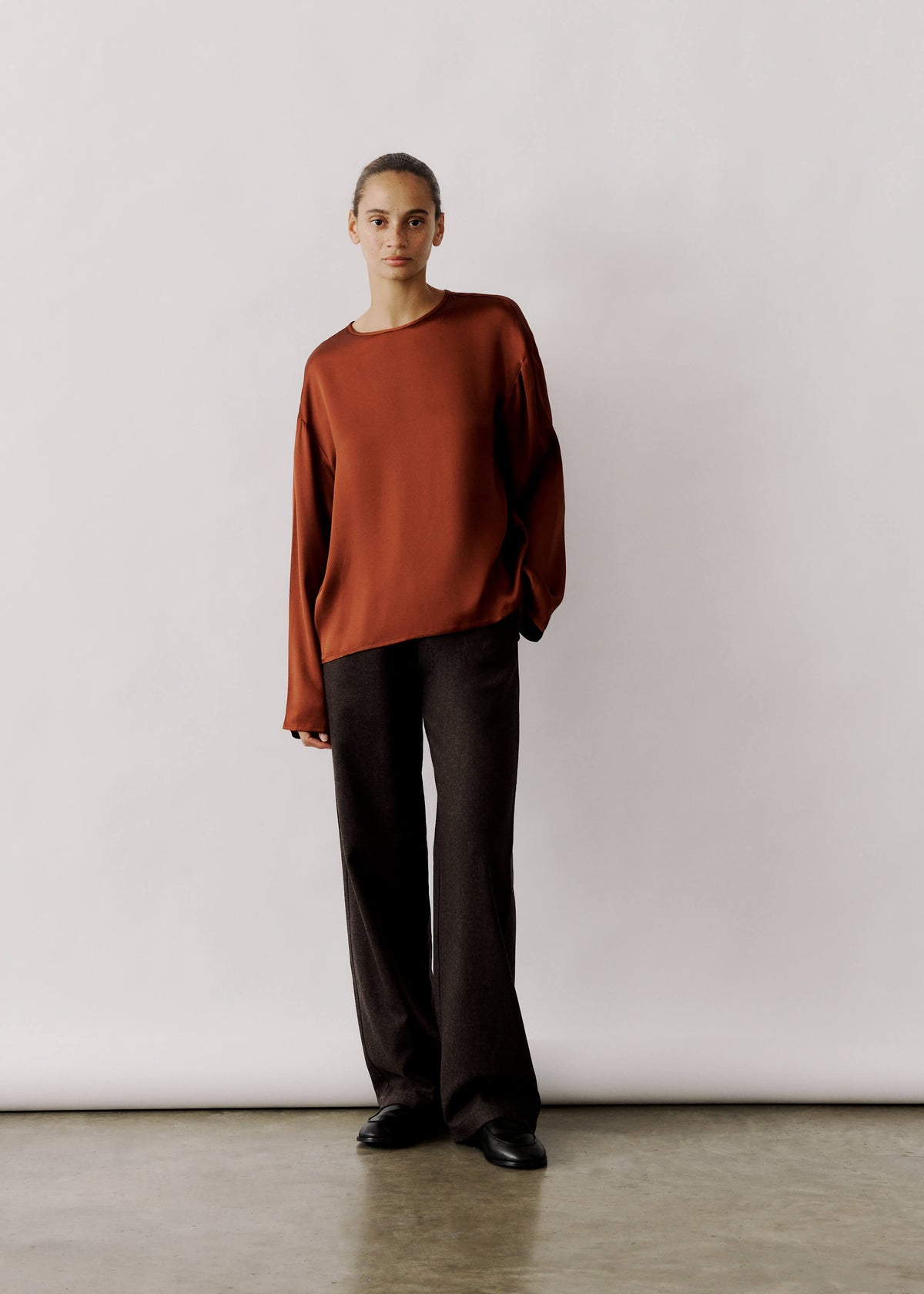
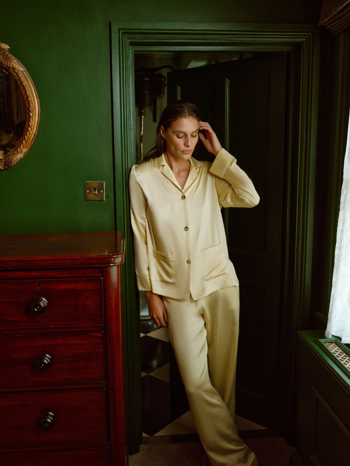
Echo the print’s sheen with a luxe silk layer.

2. Choose complementary, contrasting or tonal blazer hues for a cohesive wardrobe
Draw a colour from the pyjamas, whether a dominant shade or a subtle accent, and choose a blazer in that hue with slightly reduced saturation or altered lightness so the outfit feels coordinated rather than overtly matched. For contrast, locate the complementary hue on the colour wheel and select a desaturated or deeper version to allow the print to stand out without overwhelming it. To create a polished tonal look, remain within the same colour family while varying value and texture; for example, pair a pale patterned pyjama top with a deeper, matt blazer to introduce depth and cohesion.
Anchor busy or small-scale prints with a neutral blazer in navy, grey, camel, black or white, and allow the jacket’s structure and sheen to determine whether the ensemble reads relaxed or refined. Match your blazer to the print’s scale and fabric: small, dense motifs benefit from calmer, tonal or neutral jackets, while larger, graphic patterns can take bolder contrasts. Always assess options in natural light, and use fabric texture and accessories to harmonise any awkward colour relationships.
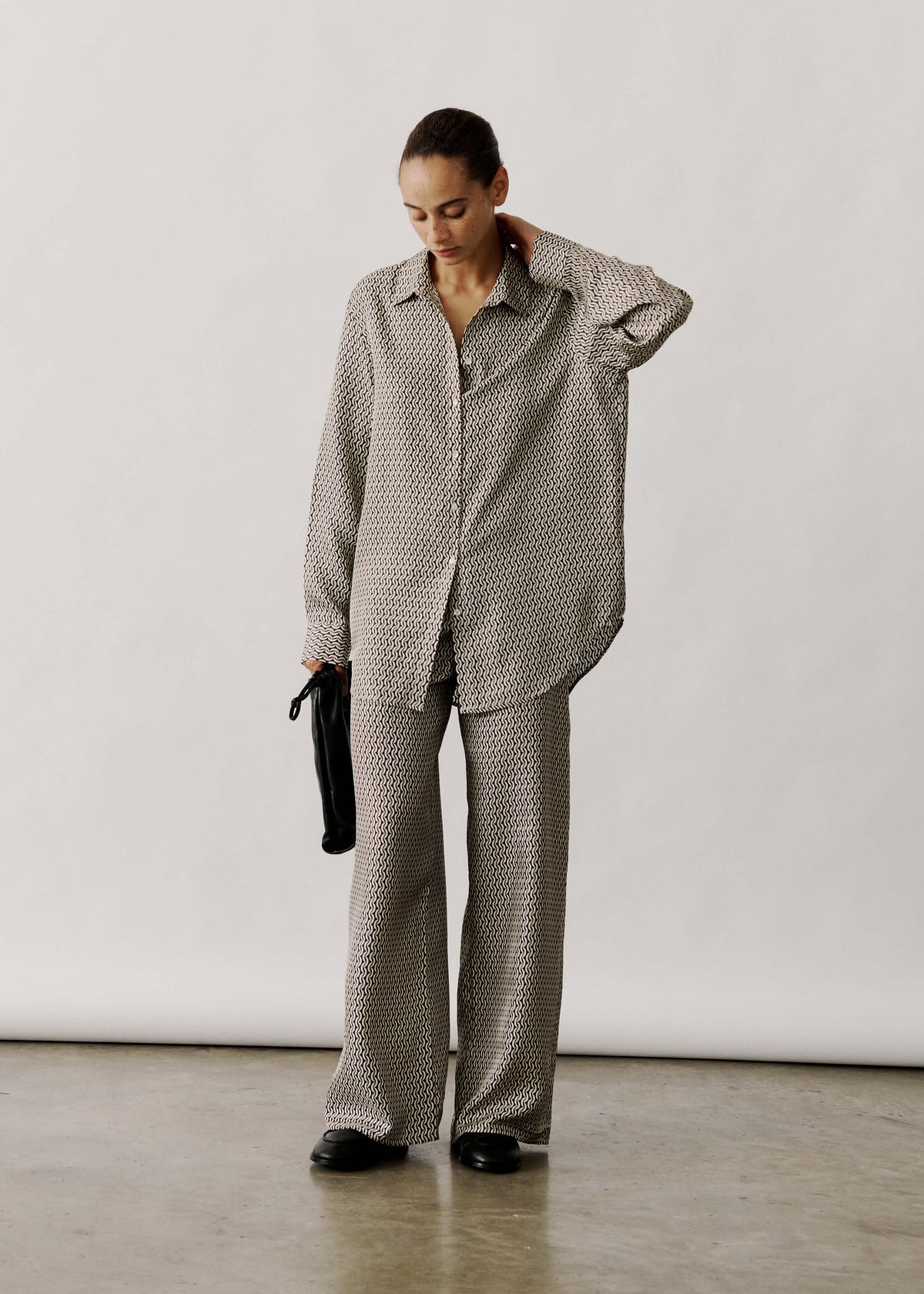
Complete the look with lightweight organic cotton trousers.

3. Consider fabric, texture and the depth of colour
Fabric finish can change how a print reads on the body. Glossy silks reflect light, sometimes intensifying colours and at other times softening them, while matte wools and crepes absorb light and anchor hues. View combinations in natural daylight as well as under indoor lighting to compare the effects. Match the blazer's weight and drape to the pyjamas' silhouette: a heavier, structured fabric will hold its shape and balance a slouchy cut, whereas a soft, unlined blazer will follow the pyjamas' fluidity and create a relaxed, cohesive look. Try each pairing on rather than on a hanger to judge how movement and light alter perceived colour and proportion.
Introduce a textural contrast to add depth: pair smooth, printed pyjamas with a textured blazer in bouclé or cord so the textures enrich the look without adding competing colours. Avoid two heavily textured pieces in clashing hues, which create visual noise. Treat colour saturation separately from hue: a highly saturated print benefits from a desaturated or neutral blazer to let the pattern read clearly, while matching saturation yields a bold, unified statement but can lead to elements competing. Let print scale be your final guide: large, bold prints often need a solid, structured blazer to frame them, whereas small, intricate prints can tolerate subtle patterns or textures. Always try the combination on the body to ensure the intended effect.
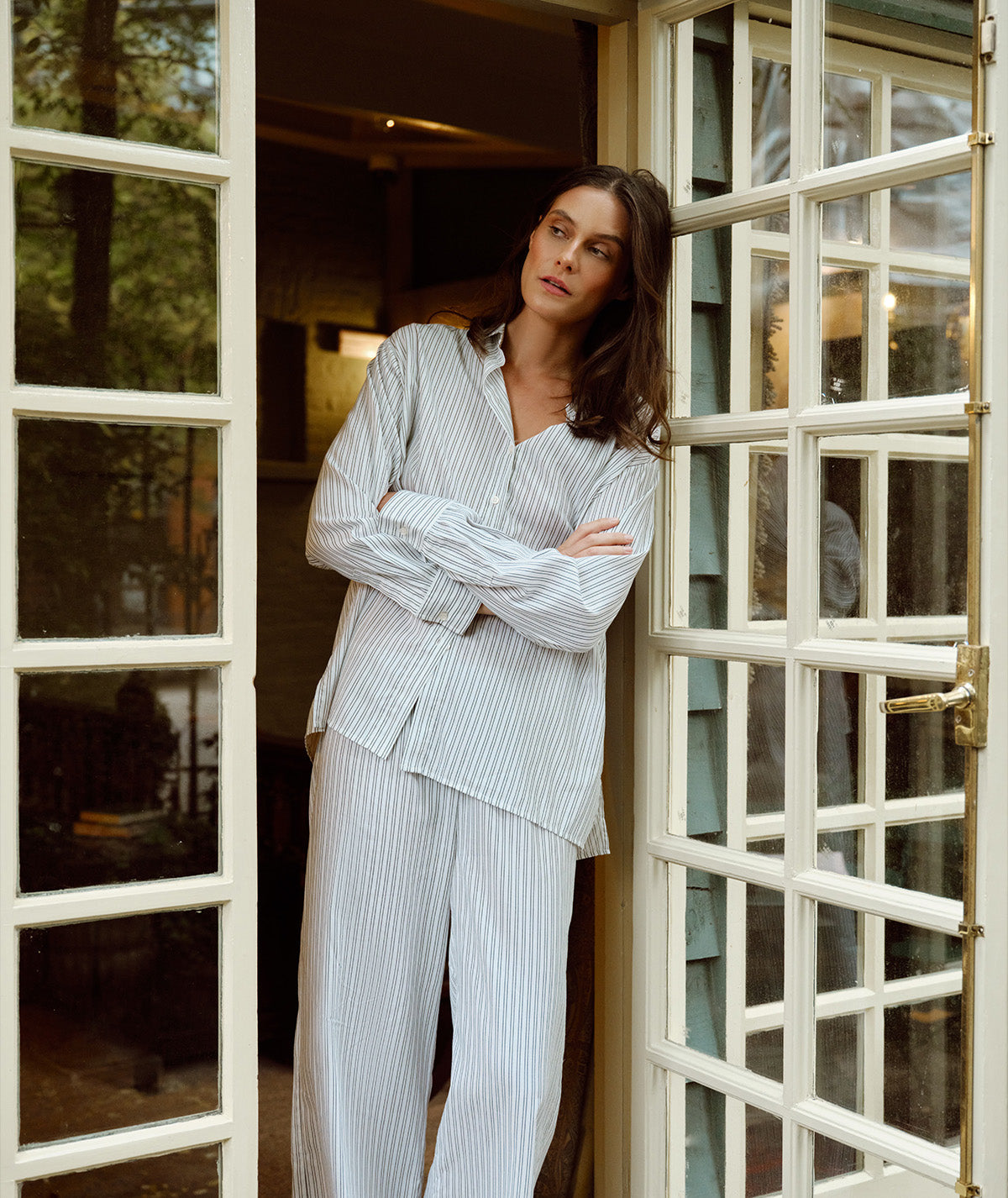
Pair with lightweight cotton trousers for balanced contrast.

4. Match blazer cut and colour to occasion and silhouette
A structured single-breasted blazer with softly defined shoulders and a nipped-in waist brings tailored balance to a relaxed pyjama silhouette, making the ensemble suitable for meetings or receptions. Opt for cropped or waist-length cuts to emphasise the waist, particularly when worn with high-waisted or tapered pyjama trousers; shorter lengths prevent excess fabric from overwhelming the silhouette and create a cleaner line. Let the blazer colour direct the eye: choose a shade drawn from the print for cohesion, a neutral low-contrast tone to allow the print to remain the focus, or a high-contrast choice for a considered, fashion-forward statement.
Select a blazer fabric and finish that suits the occasion. Matt, structured weaves read as formal and photograph well, while softer finishes such as satin or lightweight linen harmonise with pyjama fabrics for evening or holiday looks. Balance proportion by matching print scale to the blazer's lines: large, bold prints are best paired with simpler silhouettes and slimmer cuts to avoid visual clutter. Small-scale prints, by contrast, can take richer colours or wider lapels, adding personality without overwhelming the eye. Subtle adjustments to sleeve length and shoulder width refine the proportions and keep the overall silhouette flattering.
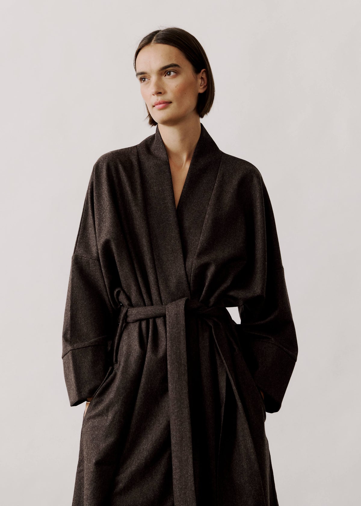
Style with wool-flannel trousers for polished, cosy tailoring.

5. Use layering and accessories to create harmonious colour balance
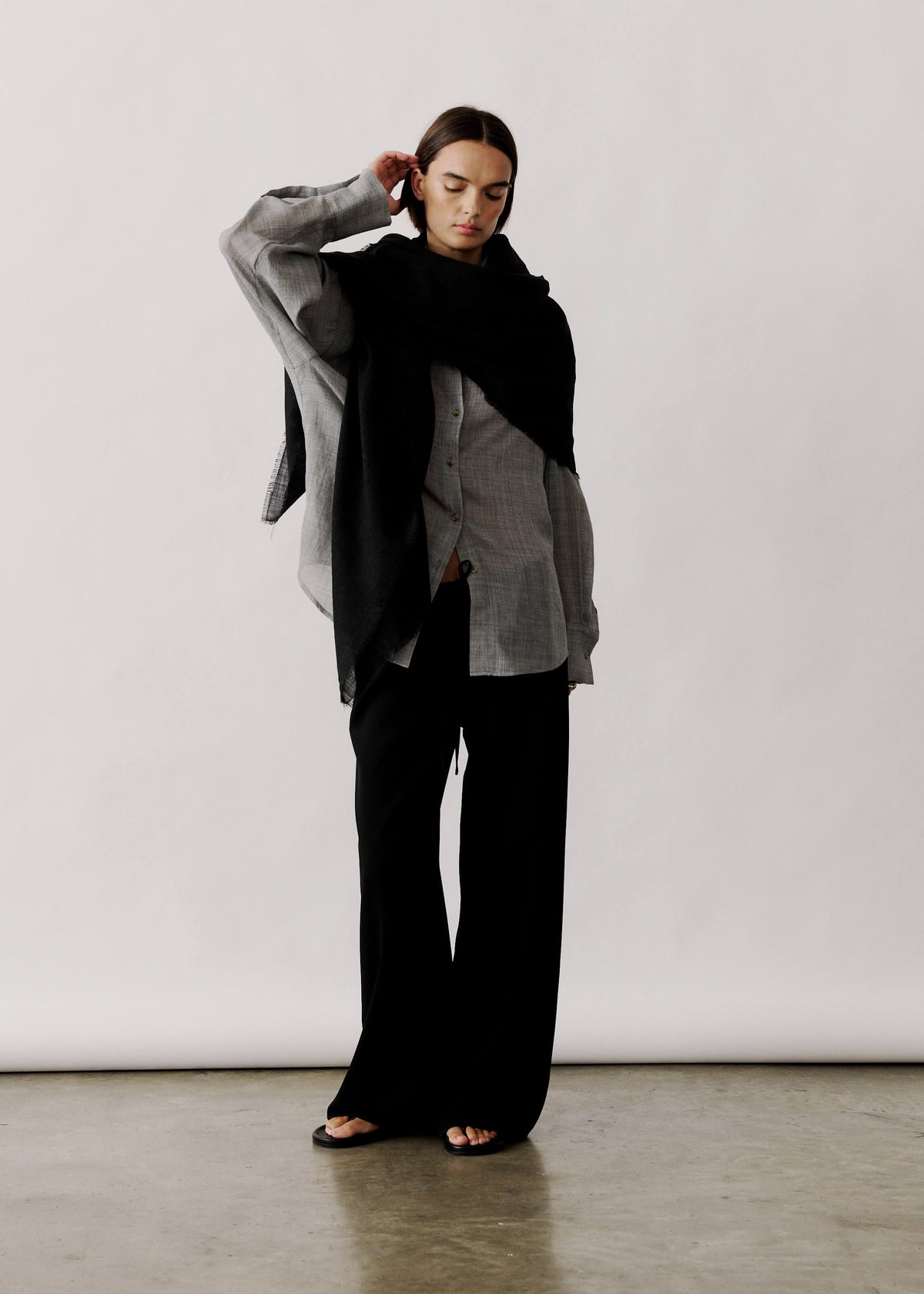
Anchor the look with a single neutral piece, for example a navy, beige, black or cream blazer, camisole or bag, to calm a busy print and allow the pyjamas to remain the focal point. Select one colour from the print and repeat it across two or three accessories, such as a silk scarf, belt or shoes, to create cohesion without overwhelming the eye. Control perceived intensity through considered textures and finishes: a matte, structured blazer or a fine knit will soften glossy pyjama fabric, while satin will heighten its sheen; switching jewellery to warm or cool metal tones will further harmonise with the print. Finally, manage proportion by choosing cropped or longer blazers and belt widths in keeping with the print scale, breaking up large pattern blocks and preserving visual balance.
Match accessory scale to the motif: favour larger, statement pieces with fine-scale prints and smaller, subtler pieces with bold motifs so the accessories complement rather than compete. Choose gold or silver to echo warm or cool undertones, repeat that subtonal colour across one or two carefully chosen accents, and keep remaining accessories restrained to preserve a polished finish. These small adjustments ensure a printed pyjama set reads as considered and refined rather than chaotic.
Treat a printed pyjama set as a colour palette to be studied and refined. Identify the dominant and accent colours, observe undertones in natural light, and balance hue with fabric, texture and colour saturation. Choosing a blazer becomes an intentional decision: echo a background or accent shade for cohesion, opt for a complementary or gently desaturated tone for contrast, or compose a tonal ensemble by varying value and finish.
When choosing cut, weight and texture, consider the scale of the print and the occasion. Try three pairings on the body and photograph each option to see which best showcases the pattern without overwhelming it. From those trials, repeat one or two accessories to create a considered, polished look. Begin with a single, thoughtful pairing and refine from there.


Leave a comment
This site is protected by hCaptcha and the hCaptcha Privacy Policy and Terms of Service apply.