

5 Colour and Print Rules to Maximise the Versatility of Silk Trousers
Silk trousers can feel relaxed by day, and refined by night, depending on colour, print, and finish. Yet they often sit underused in wardrobes, where a single pattern or hue can make pairing feel awkward and one-dimensional.
Follow five practical rules to create versatile, considered outfits: build a neutral base, dress tonally, manage print scale and placement, introduce a single accent colour, and elevate looks with texture and metallic accents. Applied together, these principles broaden outfit combinations, simplify styling decisions, and turn one pair of silk trousers into multiple, distinct looks.

1. Create a neutral wardrobe foundation for effortless styling
Begin with two core neutrals that flatter your skin tone. Hold silk trousers beside your face in natural light to see whether the colour warms or cools your complexion. Use those neutrals as a restrained backdrop so patterned shirts, printed blouses, and bright knitwear become the focal point, multiplying your workable outfit combinations. Keep shoes and accessories within the same neutral family to create seamless looks, then swap footwear or add a patterned scarf or belt to shift easily from casual to formal.
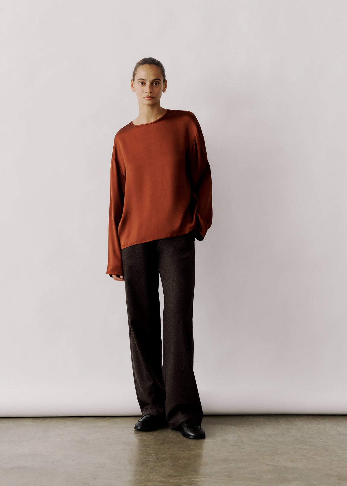
Also introduce contrasting textures, such as matte knits, crisp cotton shirts, or soft suede, to counter silk's sheen and stop prints from reading as overly busy. Build tonal outfits by layering light to dark shades within a single neutral family, for example a cream top, a camel layer, and chocolate trousers, so the ensemble reads as deliberately composed. A restrained, tonal base makes a single printed or coloured piece feel intentional rather than accidental. Taken together, these strategies expand outfit combinations and make transitions between casual and formal dressing feel seamless.
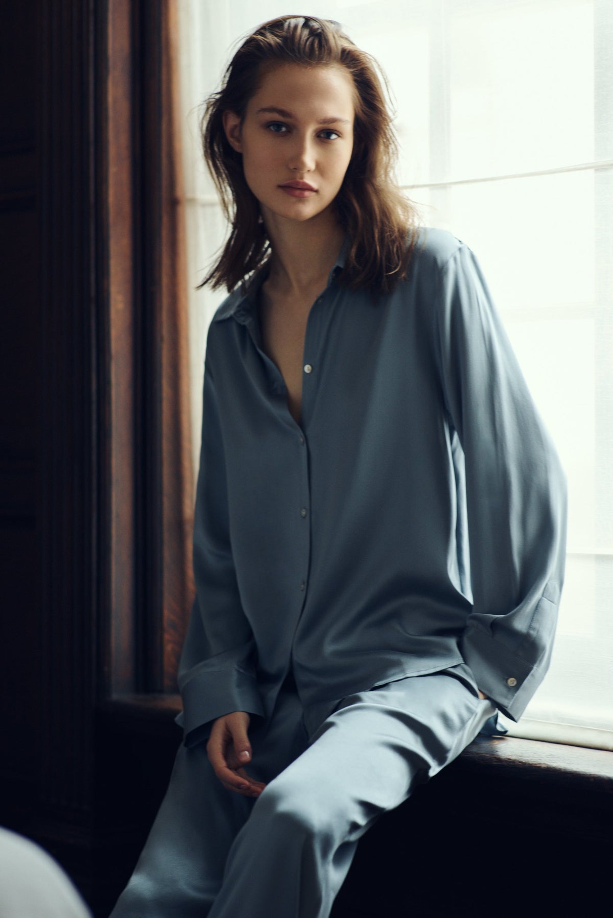
Add a cool silk shirt for tonal day-to-night looks.

2. Dress in tonal colours to make styling effortless
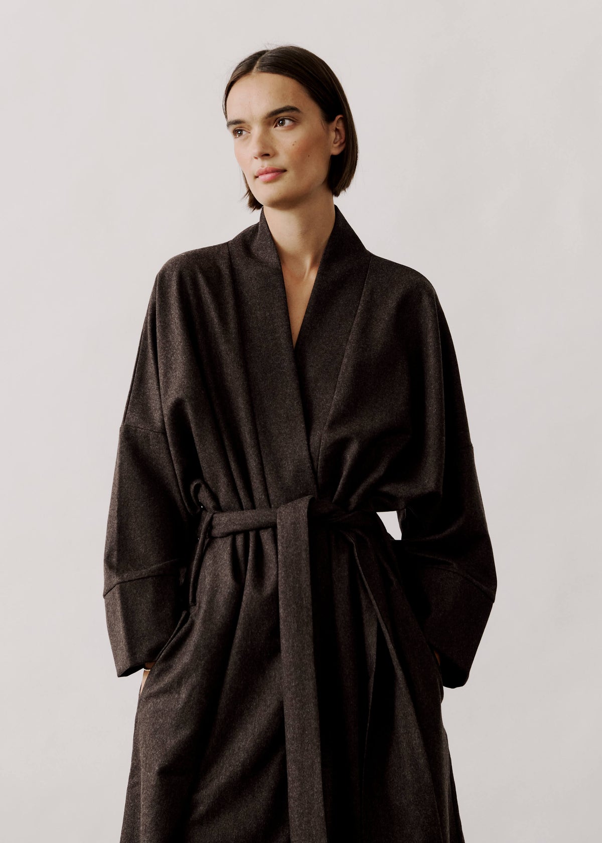
With a neutral foundation in place, start by identifying the trousers' base tone and undertone, then select tops and outerwear from the same colour family. Warm-toned silk pairs with cream, camel, and rust; cool-toned silk sits naturally with dove grey, navy, and steel blue, creating immediate cohesion. Use a subtle difference in lightness to shape the silhouette: darker silk trousers paired with a lighter top raise the visual waist and lengthen the leg, while the reverse grounds a floatier top. Introduce varied textures, such as a matte knit, a crisp cotton shirt, and soft suede shoes, to add depth while keeping the outfit unified.
Also, choose prints that echo the trousers' tone: a striped or checked shirt, or a floral with one dominant shade set against a neutral background, so patterns feel coordinated rather than competing. Match belt and shoes to the trousers' colour, and select metals that harmonise with the undertone to integrate accessories. Reserve any contrasting accent for a single small piece, such as a scarf or pocket square that repeats an existing colour, so the look gains interest without disrupting cohesion. Together, these choices simplify styling and make each outfit read as intentional, enhancing the trousers' versatility.
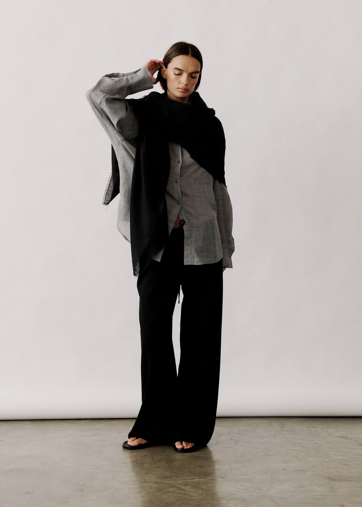
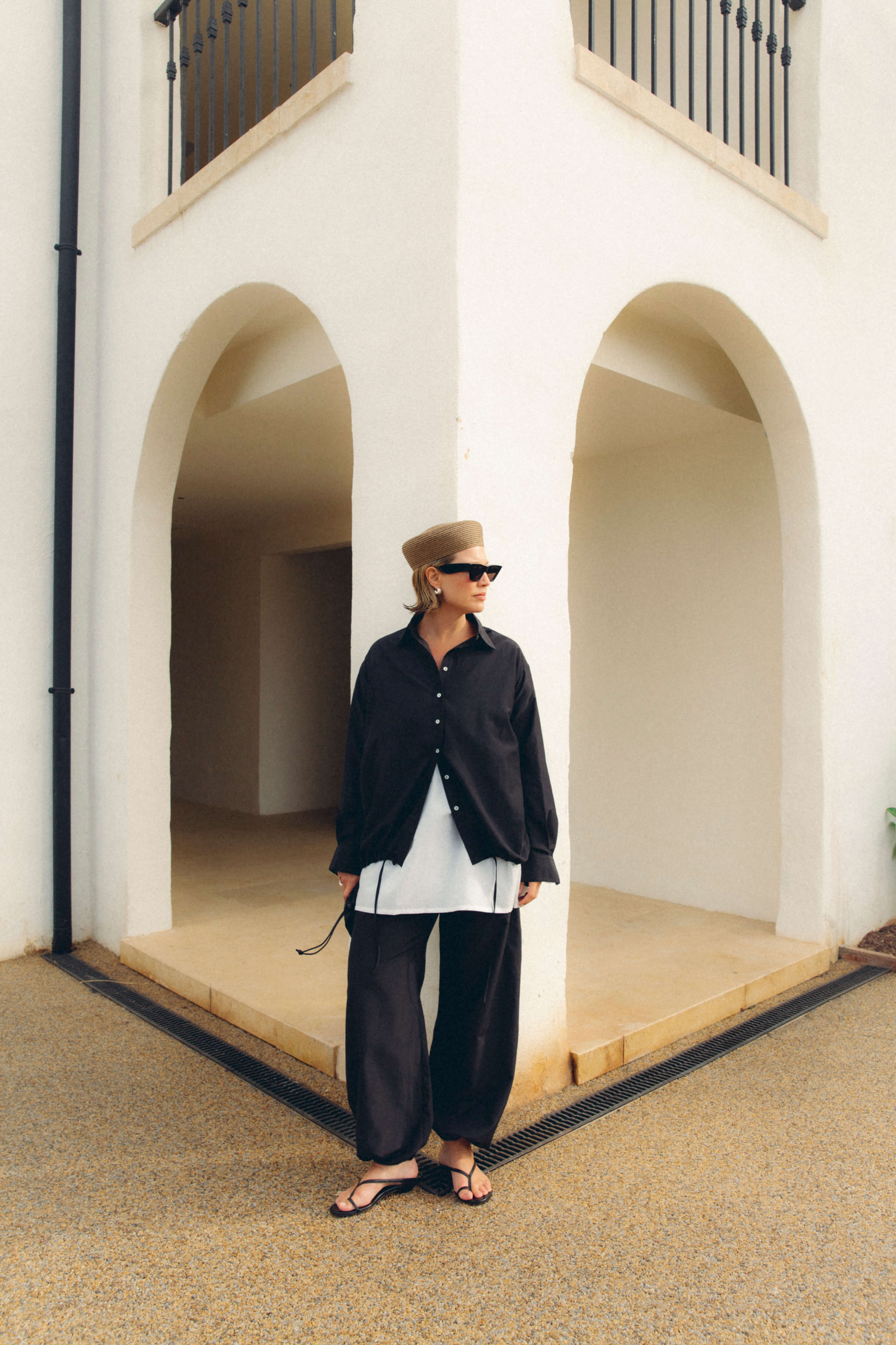
Anchor looks with a black silk-cotton trouser.

3. Control print scale and placement to refine formality
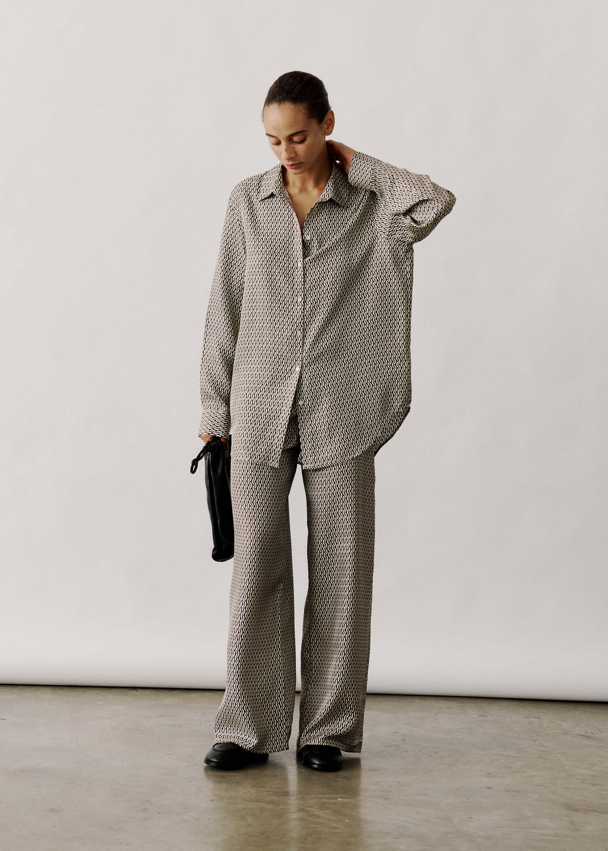
Once you have settled colour and tone, print scale determines how silk trousers read from across a room. Small, dense repeats tend to read as a textured solid, making them easier to pair with smarter pieces. Large, bold motifs remain legible at a distance and act as a casual focal point, so view trousers from across the room before deciding how formal you want the look to feel. Contrast also alters perceived formality: low-contrast, tonal prints appear subdued and refined, while high-contrast graphics read louder. Favour closer tonal values for smarter settings, and reserve high-contrast combinations for relaxed outfits. Placement affects the leg line. Vertical motifs, side panels, and elongated repeats lengthen the silhouette, whereas wide horizontal bands or concentrated prints around the hip can shorten or widen it. To emphasise length, align vertical elements with the trouser crease.
Match print scale to trouser shape and body proportion. Very large motifs create visual weight and can overwhelm petite frames, while micro-prints often read as texture and can disappear on fuller silhouettes. Choose medium-to-large scales for wide-leg or voluminous cuts, and finer scales for tapered or cropped trousers to keep the print in proportion with the shape. When mixing patterns, establish a clear scale hierarchy: let one print dominate and pair it with a second at a noticeably different scale to avoid visual confusion. Pay close attention to tailoring details, because seams or pockets that cut through a motif can make a print appear clumsy. Where possible, align repeats at seams, or place pockets to intentionally interrupt the pattern for a considered, tailored effect. Thoughtful scale and placement let you use print to enhance proportions and maintain a coherent, purposeful look.
Let a bold silk print define evening silhouettes.

4. Use a single accent colour to transition from day to evening
To shift a look from day to evening, choose a single accent colour, ideally drawn from the trouser print or a complementary or analogous shade for plain trousers, to create visual cohesion. Use that colour as your evening focal point in shoes, a blazer, or a silk blouse, and reserve it for smaller daytime accessories, such as a scarf, belt, or bag, so proportion subtly shifts perceived formality. Vary depth and finish between day and night: opt for a deeper, more saturated tone and glossier materials or jewellery after dark, and choose paler, matte, or textured versions for daytime restraint. Finally, view combinations in natural light to confirm the hue performs as intended.
Repeat the accent in two considered details, such as lipstick, nail polish, or a hair accessory, so the eye rests on the colour without feeling cluttered. When trousers carry a print, lift a secondary hue from the pattern and echo it elsewhere; when trousers are solid, choose complementary tones for contrast or analogous shades for harmony. Limit repetition to two or three placements, and adjust both placement and material so the accent reads as a deliberate choice.
Anchor evening looks with luxe velvet trousers

5. Elevate outfits with tactile fabrics and subtle metallic accents
To finish an outfit, use silk's natural sheen to create distinct highlights, while metallics scatter light. Introduce a single metallic focal point, such as a belt buckle, clutch, or shoe detail, to amplify the silk's shine without competing with it. Balance glossy silk trousers with matte or napped fabrics, such as a ribbed knit, brushed cotton, or suede, to ground the outfit and add visual depth, or layer with structured tweed or boiled wool to introduce architectural shape and reduce visible creasing. Keep metallic elements small and strategic: place them near the face to lift the eye, at hems or side trims to visually lengthen the leg, and avoid several large metal pieces that break the silhouette. A single, well placed metal detail preserves proportion and maintains a coherent line.
Match the metal tone to your jewellery and hardware to form cohesive groupings. Warm golds share an undertone with camel and burgundy, while cool silvers sit naturally beside navy, charcoal, and icy pastels. For casual occasions, pair silk trousers with a matt knit, leather loafers, and subtle metallic hardware to introduce a restrained sheen; for dressier evenings, amplify texture with a metallic-thread top, glossy shoes, or a statement clutch so the outfit appears cohesive in artificial light. Choose the scale of metallics to suit the occasion, favouring small accents by day and bolder pieces after dark.
Make silk trousers work harder: begin with a neutral base, build with tonal layers, control print scale and placement, introduce a single accent colour, and finish with a touch of texture or a metallic flourish. These five practical rules streamline pairing, preserve proportion, and turn one pair into distinct day and evening looks.
Use the headings as a step-by-step checklist: build your neutrals, dress tonally, manage print scale and placement, choose a single accent, and layer texture and metal to finish the outfit. Apply these steps in natural light or before a mirror to expand your combinations, reduce indecision, and step out with clearer purpose.

Leave a comment
This site is protected by hCaptcha and the hCaptcha Privacy Policy and Terms of Service apply.