
Five timeless wardrobe essentials to anchor printed ensembles
Printed pieces can breathe new life into a wardrobe, yet they often read as fleeting or tricky to style. How can a statement pattern feel intentional, wearable and truly versatile?
This guide breaks down five practical approaches: building a neutral base, coordinating colour and print scale, balancing silhouette and proportion, choosing textured fabrics and sustainable fibres, and layering and accessorising with intent. Use these strategies to mix prints confidently, stretch outfit possibilities, and choose pieces that endure across seasons and occasions.

1. Build a refined neutral base for effortless, versatile dressing
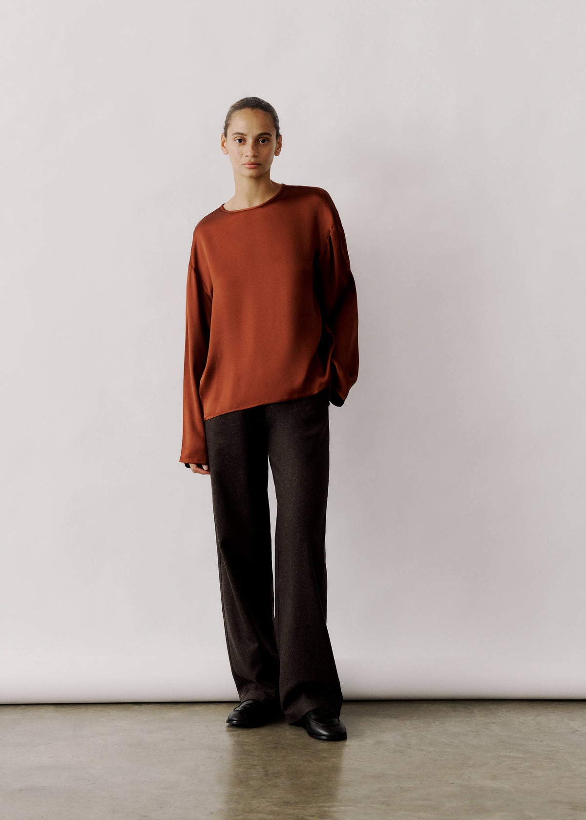
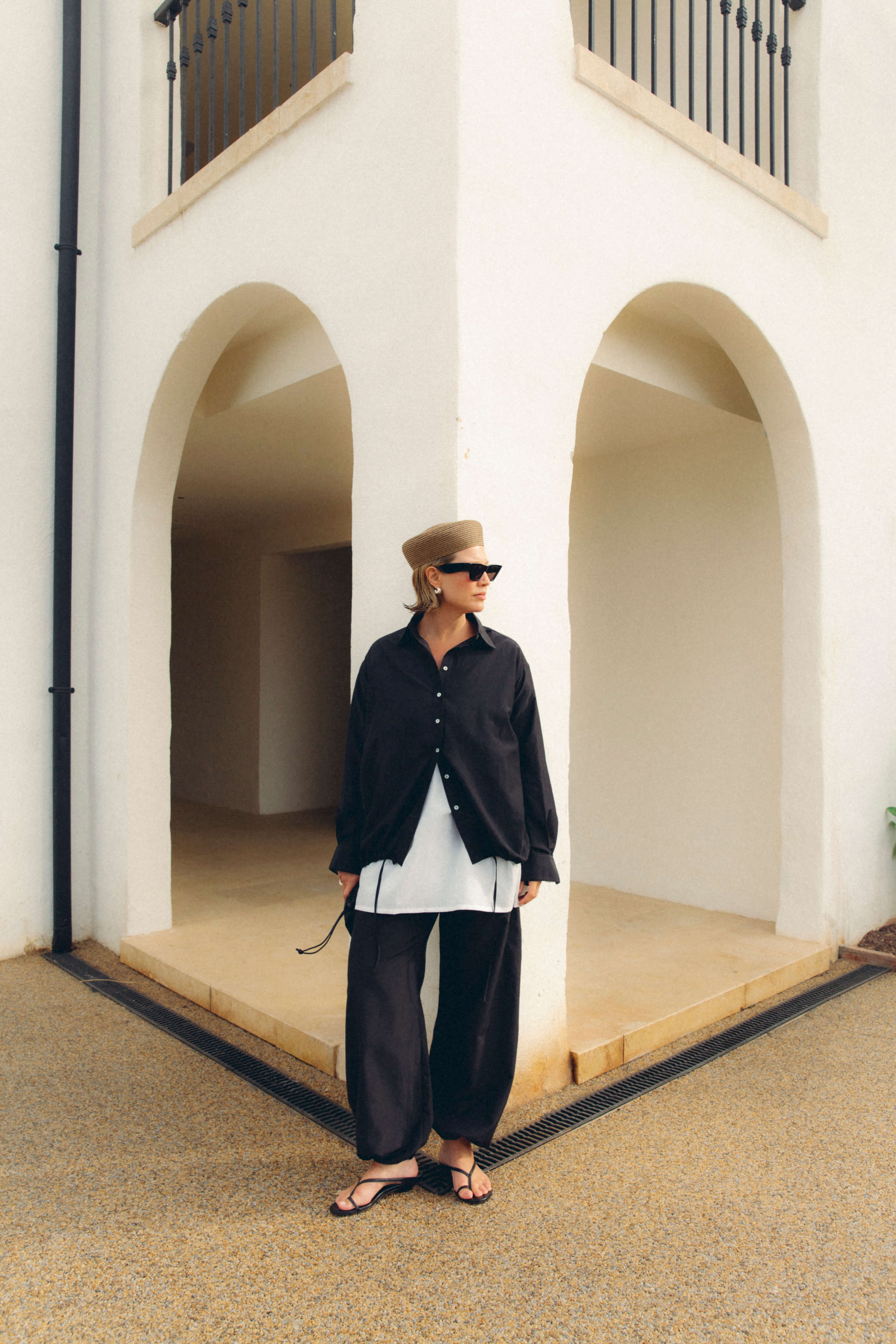
Select a three-colour neutral palette, for example ivory, mid-tone tan and charcoal, and limit core pieces to those tones so each printed item can be paired with multiple outfits without clashing. Prioritise clean, classic silhouettes such as a fitted shirt, straight-leg trousers, a single-breasted coat and a simple knit; check the fit at the shoulder seam, sleeve length and waist, as small tailoring adjustments can improve how prints sit and how a look reads overall. Use texture and tonal contrast to keep neutrals interesting by pairing matte cotton with polished leather or a soft knit with crisp poplin, allowing the base to remain composed while giving prints room to breathe. Anchor a printed piece with one solid focal neutral, then echo that tone in shoes or a bag to create visual balance and a longer line, enabling more outfit combinations from a single print.
Assess colours in natural light to avoid subtle mismatches. Warm neutrals sit beautifully with warm metals such as gold, while cool neutrals pair naturally with silver. Repeat a key neutral across accessories to lengthen the silhouette and to echo a print within the outfit. These considered choices bring coherence to a look and unlock more combinations from each printed piece.
Anchor neutrals with a lightweight striped Tencel dress.

2. Coordinate colour and scale of prints for harmonious looks
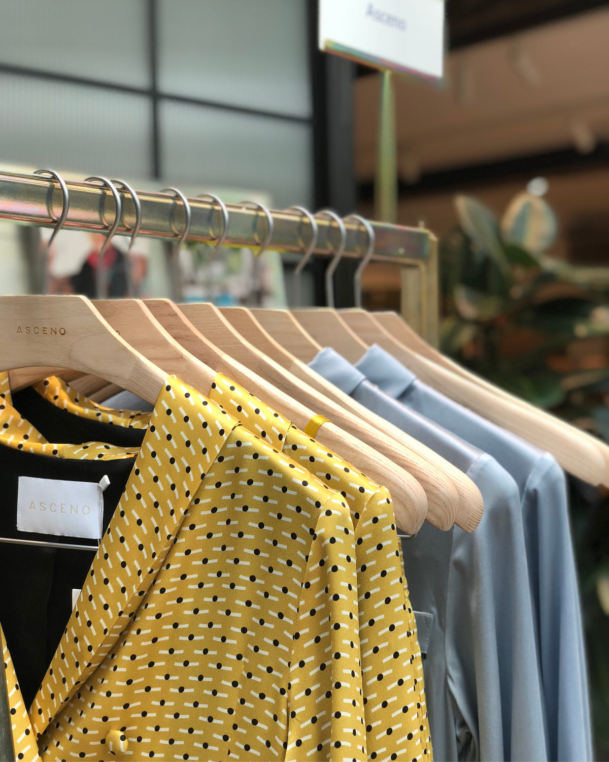
Pair a dominant print with a solid in a colour taken from the pattern to achieve an immediate, harmonious look. For example, lift a mid‑tone from a floral and wear it as a blazer or skirt to prevent the pattern from competing with itself and to gently guide the eye. Maintain consistency in print scale and colour saturation so that high-contrast, vivid patterns sit comfortably alongside equally vibrant pieces, while muted, tonal prints pair best with subdued solids. Balance one large-scale print with a small-scale repeat or plain pieces to avoid visual clutter.
Anchor printed pieces with a single neutral colour or a neutral texture, such as matte wool or soft leather, to ground patterns without introducing competing hues. Keep competing elements to a minimum by choosing one dominant print, one supporting print or patterned detail, and one solid anchor. Echo a colour from the print in accessories to unify the look. Match the scale of accessories to the scale of the print, pairing chunky jewellery with large graphics and delicate pieces with finer repeats to maintain a clear rhythm. These decisions make the outfit easy to read and allow the eye to travel through the look with calm intent.
Lift a green tone to harmonize prints.

3. Balance silhouette and proportion for flattering, timeless shapes
Match the scale of a print to your frame: finer, more compact repeats flatter a petite silhouette, while larger motifs read as a considered feature on a broader canvas or when positioned below the waist to avoid overwhelming the torso. Balance volume with intent by pairing a fitted top with a full printed skirt, or by tucking a billowy blouse into slim, high-waisted trousers to create a defined waist. Opt for structured pieces with defined seams, a crisp collar or clean tailoring to lend shape beneath busy patterns and prevent prints from appearing shapeless.
Create focal points with waist-defining details such as belts, built-in waists or contoured seams so a printed outfit reads in manageable sections; a break at the natural waist will create a subtle hourglass silhouette. Use the rule of thirds to set pleasing proportions, allowing a printed piece to occupy roughly one third or two thirds of the look and introducing solids to provide deliberate pauses. Layer a plain jacket over a printed dress or tuck a printed blouse into simple trousers so the eye can rest and the pattern reads as an accent. Mind hem and shoe lines as well, since showing a sliver of ankle with cropped trousers lengthens the leg and balances voluminous prints.
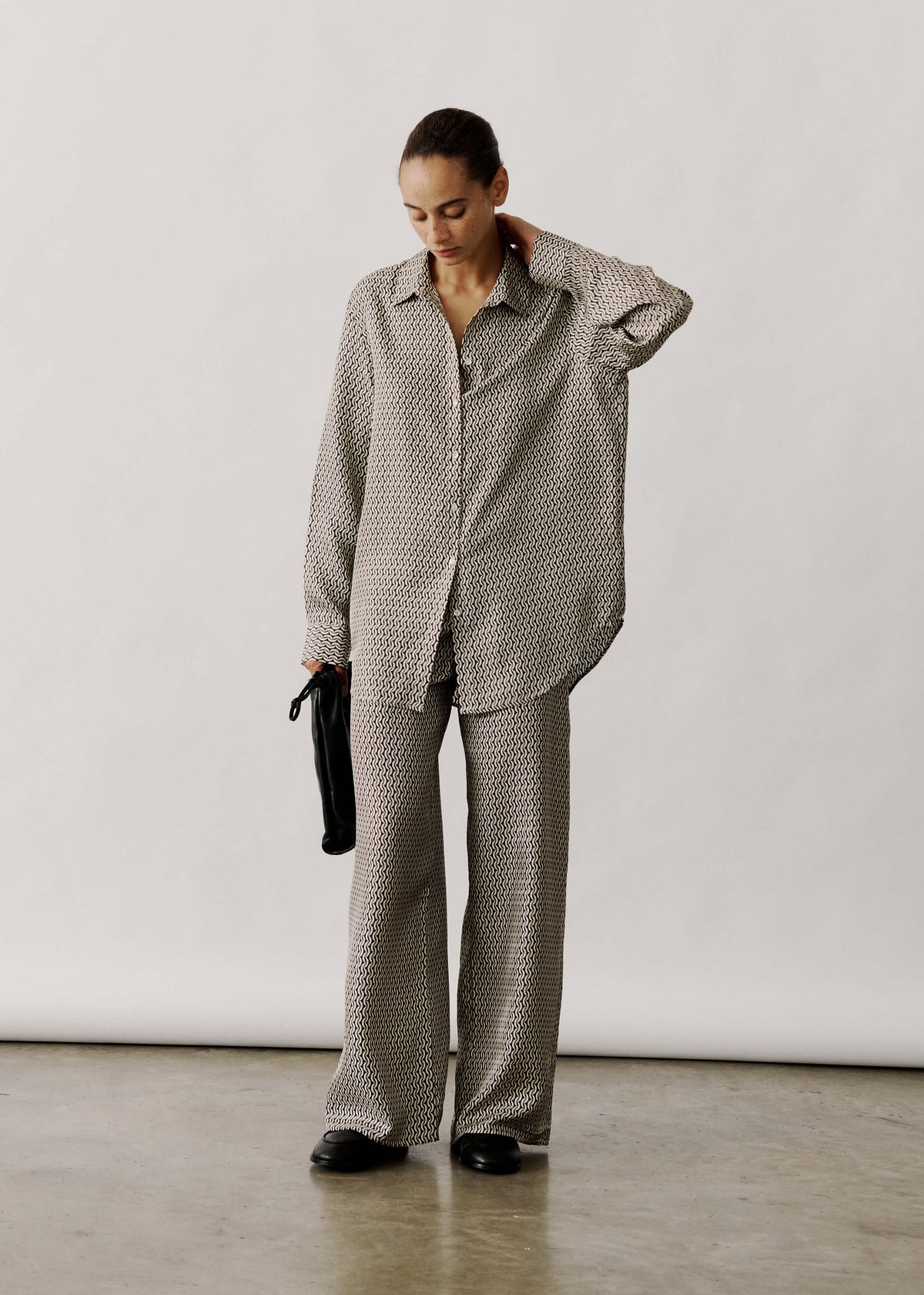
Balance busy prints with relaxed silk trousers.

4. Choose textured fabrics and sustainable fibres for lasting tactile elegance
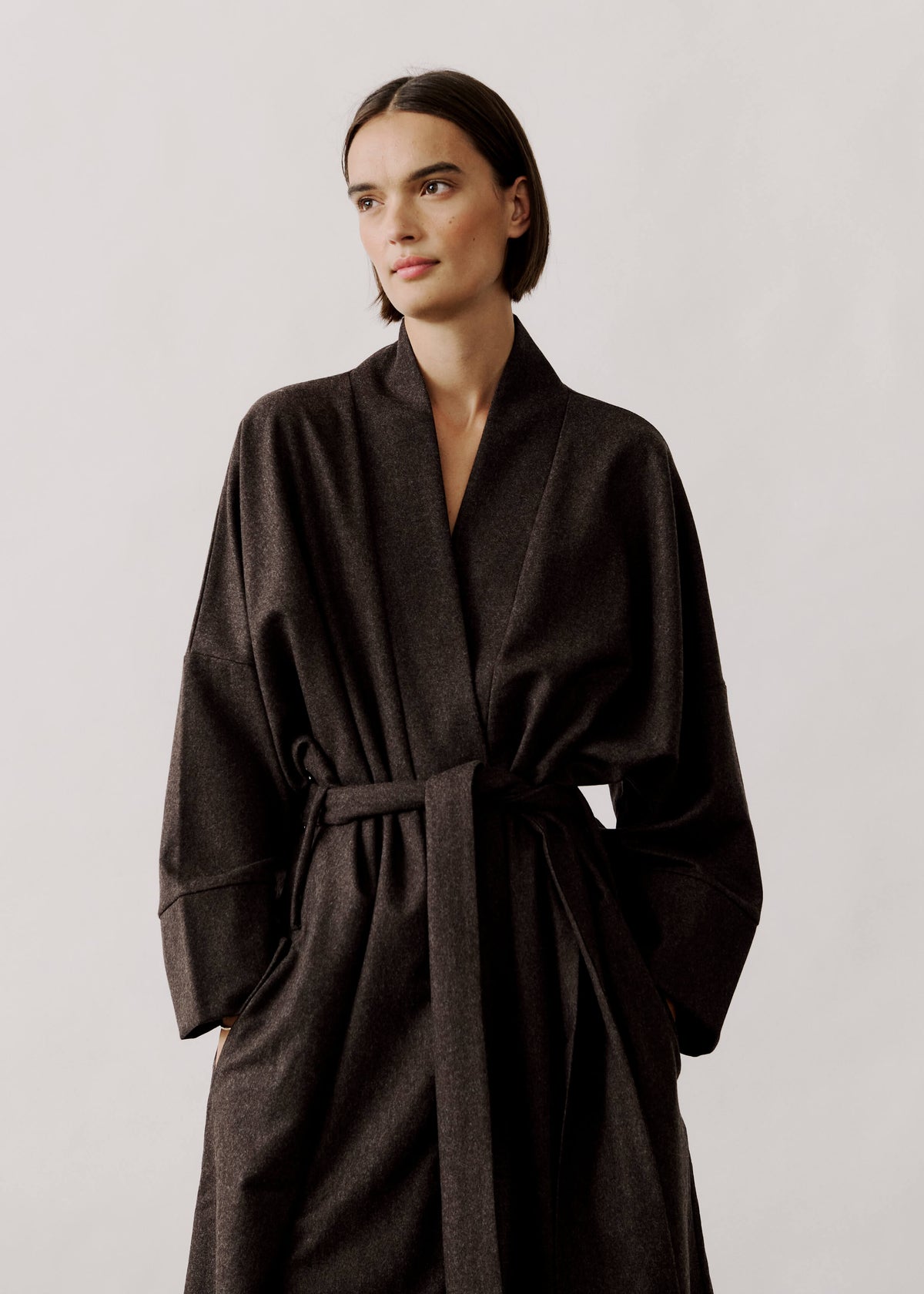
Introduce a single textured neutral, such as a ribbed top, boucle cardigan or twill jacket, to calm a busy print. A tactile resting point prevents patterns from competing for attention and gives a composed, considered finish. Prioritise sustainable fibres with the right performance: linen and hemp breathe and develop character with wear, lyocell drapes beautifully and resists pilling, and recycled or regenerated cellulosics reduce reliance on virgin materials. Balance matte and sheen to anchor colour and motif by pairing a matte textured layer with a glossy printed piece, or by placing a gently structured weave beneath a flowing print to preserve silhouette. Choose fabrics that endure and are easy to care for. Check weave density, test stretch recovery where possible, and follow care labels so garments retain their anchoring role and help to minimise environmental impact.
Look for verified sustainability information and clear fibre traceability: check composition labels, enquire with makers about sourcing and production practices, and seek recognised certifications or transparent supply chain statements that confirm reduced chemical use or the inclusion of recycled content. Match a fibre's properties to a garment's purpose. For example, choose fluid lyocell for blouses, durable twill for trousers and breathable linen or hemp for warm-weather layers so each piece performs as intended. Maintain and repair well-made garments to keep them functional and looking their best within a curated wardrobe, reducing the need for replacement.
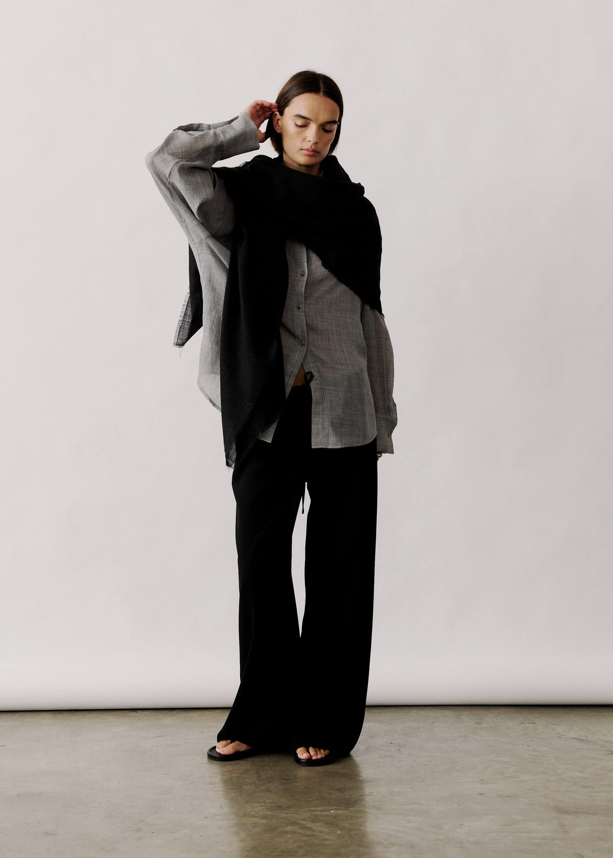
Offers breathable linen layering to anchor warm-weather outfits

5. Layer and accessorise with thoughtful restraint for timeless style
Anchor a busy print with a neutral base layer such as a plain camisole, slip dress or tailored blazer to create a visual pause and prevent the pattern from overwhelming the look. Select one colour from the print and echo it in key accessories such as shoes, a belt or a bag; repeating a single tone unifies the outfit, while varying materials introduces subtle contrast without clutter. Introduce structure with a fitted jacket, a nipped-in waist or a cropped coat to give shape to floaty dresses or wide-leg trousers so the print reads as intentional.
Layer differing textures and finishes to introduce depth and allow each piece to read distinctly. Consider a chunky knit over a floral dress, a leather jacket with a printed skirt, or a silk blouse beneath a matt jacket. Let these textural contrasts draw the eye and prevent the outfit from appearing flat. Define the focal point with jewellery and small accessories by choosing a single statement piece or a selection of pared-back items, and create a vertical line with a scarf or pendant to guide attention. Avoid competing accents so the eye has a clear place to rest.
Printed pieces expand outfit possibilities when anchored with a clear visual logic and considered basics. Building a neutral base, coordinating colour and print scale, balancing silhouette and proportion, choosing textured fabrics and sustainable fibres, and layering and accessorising with intent turn statement patterns into wearable, versatile looks.
Mix prints with quiet confidence using five considered approaches. Begin by assessing fit and fabric so each piece hangs and moves as intended. Echo a key neutral in your accessories to create a continuous visual line and unlock multiple outfit combinations. Treat texture, proportion and colour as practical design tools; used thoughtfully, they help printed pieces perform well, endure through regular wear and earn a reliable place in your wardrobe.


Leave a comment
This site is protected by hCaptcha and the hCaptcha Privacy Policy and Terms of Service apply.