
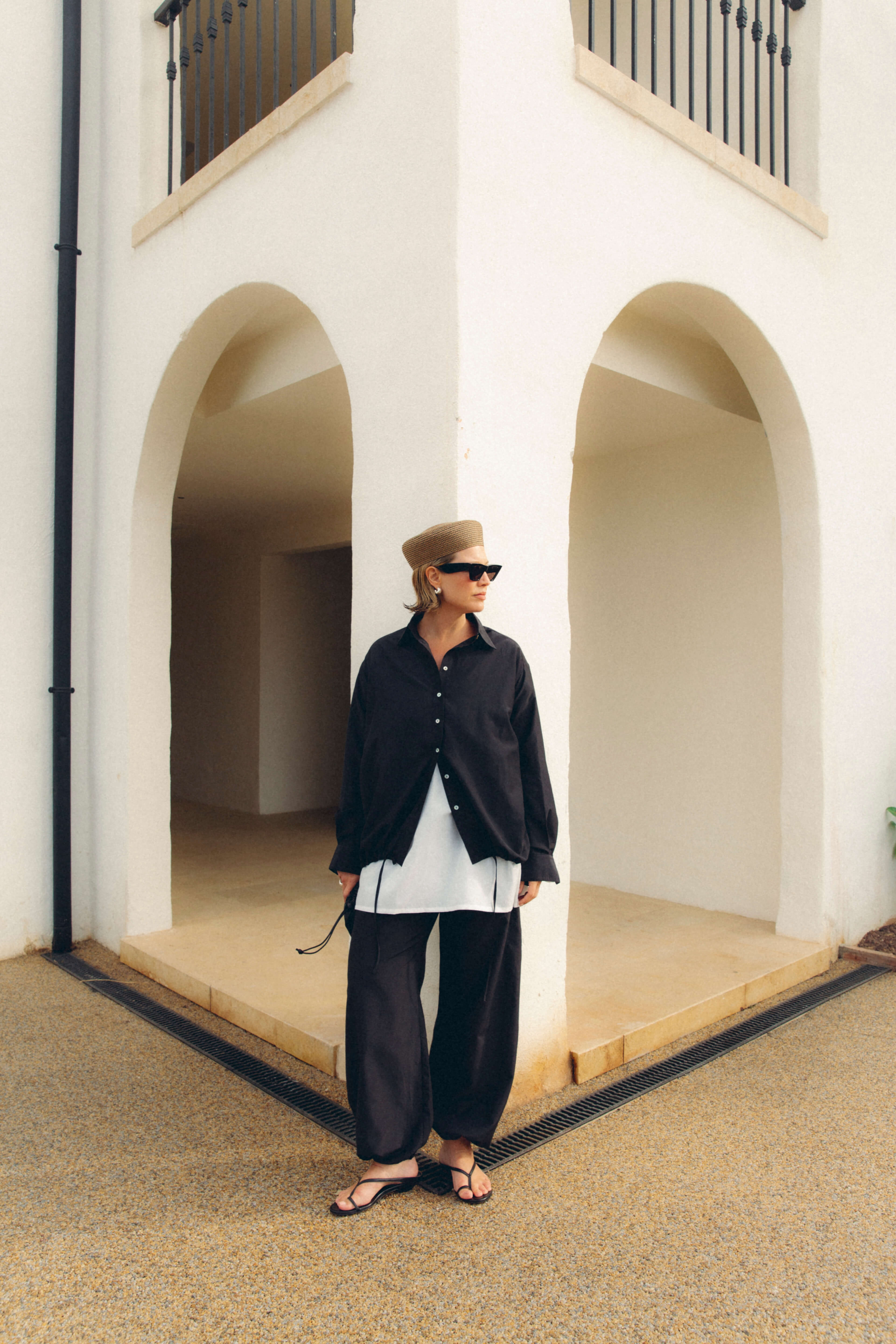


10 Colour and Finish Pairings That Harmonise Lustre and Matt
Mixing lustre and matte intentionally makes an outfit feel composed rather than accidental. Lustre catches the light and draws the eye, while matte anchors colour and proportion, and together they create depth and clarity within an ensemble.
This post breaks the process into ten practical areas: how to tell lustre from matt fabric finishes, fabrics, colour pairings, contrast, silhouette, layering, texture, accessories, styling, and care, demonstrating how subtle choices can shift perception. Apply these strategies to manage shine, balance proportion, and preserve both lustre and matte finishes over time.

1. How to tell lustre from matt fabric finishes
Lustre finishes catch light, creating bright highlights that make colour read lighter and bring surface texture forward. Matt finishes scatter light, causing colour to appear deeper and surfaces to look smoother. To observe this, hold identical swatches close to a lamp: the lustre sample will brighten at the highlight, while the matt sample will retain an even appearance. For a repeatable on-site test, apply two small samples of the same colour — one in a lustre finish and one in a matt finish — view them from arm’s length at head height, tilt to catch incidental light, and inspect for sheen, perceived colour shift, and visible brush marks.
Lustre finishes reflect light, so they emphasise surface irregularities and texture. For a flawless result, prepare and sand surfaces more thoroughly, then apply thinner, even coats to avoid highlighting imperfections. Matte finishes scatter light and tolerate minor flaws, allowing you to focus preparation where it will have the most visual impact. Reserve lustre for trims, joinery, and feature elements to draw the eye and accentuate details, and use matte on large planes such as walls and ceilings to create depth and reduce visual noise. This combination balances interest with a calm, unified backdrop. Maintain lustre surfaces with regular cleaning using a soft cloth and a mild cleaner. Treat matte finishes gently: use soft brushes or low-abrasion cleaners on stubborn spots to avoid scuffing the surface.

2. Select sustainable fabrics and refined surface finishes for longevity
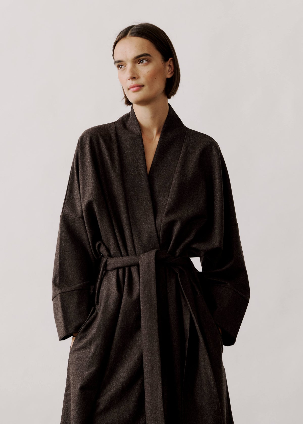
Choose fabrics by how they interact with light. Silk and satin throw specular highlights, causing colour to read lighter at points of reflection, while velvet and brushed wool absorb light and deepen the hue. Test sheen combinations at scale by placing larger swatches in the room’s actual lighting and photographing them from multiple angles, because small shop samples can mislead. Gloss can generate glare on smooth weaves, whereas textured matt surfaces scatter light and conceal irregularities. Observe how these behaviours shift perceived colour, then reserve luminous fabrics for highlights and richer, textured cloths for deeper, saturated tones.
Place higher-lustre finishes on smaller, focal items and matt on larger planes. A lustrous cushion, lampshade, or polished metal trim will read as an accent against a matt sofa, curtain, or wall. Match maintenance and wear characteristics to function. Matt finishes tend to conceal fingerprints and dye irregularities, whereas lustre emphasises surface texture and can reveal wear, so those surfaces may need more frequent cleaning. Layer contrasting textures and treatments to amplify colour depth. For example, pair a low-sheen painted wall with a satin wood varnish and a boucle fabric, or combine soft, matt linen with a metallic, low-gloss finish to introduce depth without competing highlights. These deliberate pairings let you control where the eye rests, creating depth through light behaviour rather than increased colour saturation.

3. Pair colours to balance sheen and matt tones
Test real swatches in the room: place the same pigment in lustre and matte finishes, and photograph both under natural and artificial light to reveal how reflectivity shifts perceived colour, saturation, and depth. View each swatch from multiple angles, because a finish that looks rich from the front can flatten in grazing light, and use the photographs to compare results objectively. Place finishes deliberately, reserving lustre for trim, joinery, or a single feature to catch the light, and choosing matte for large planes to reduce glare and minimise surface irregularities.
Match sheen to function by using higher-sheen paints on surfaces that require wiping and durability, such as skirting boards and cabinetry, and choosing low-sheen finishes where you want softness or to minimise surface texture, such as walls and ceilings. Balance colour saturation with finish: on larger planes, favour saturated colours in matte to avoid glare, and apply a concentrated sheen to small accents so richness is amplified without overwhelming the scheme. Create depth through contrasts of tone and reflectivity; for example, pair a mid-tone matte with a lighter gloss to achieve layered luminosity, or set a deep matte beside a subtle lustre so the dark reads richer. Test combinations in situ, under different light conditions, to see how reflectivity alters perceived colour, depth, and contrast. Selecting durable finishes for high-touch areas also reduces the need for frequent repainting, helping to lower material waste over time.

4. Use contrast to transition looks from day to night
Lustre concentrates and reflects light, making colours appear brighter and more saturated. Matt surfaces scatter light, softening tones and masking minor surface irregularities. Try a simple experiment: place a lustrous cushion and a matt cushion under a directional lamp, then beneath diffused light, and observe how the lustre catches highlights while the matt reads more even. Use one or two lustre elements as focal points against a predominantly matt backdrop. Limit lustre to roughly 10 to 30 per cent of visible surfaces so the shine feels intentional rather than overwhelming. For harmonious contrast, pair deep, matt charcoal or navy with warm, lustrous accents, or combine soft, matt pastels with pearlescent highlights to subtly lift perceived warmth.
Layer ambient, task, and accent lighting so directional lamps make reflective surfaces, such as polished metals or glazed ceramics, catch the eye, while softer, diffused sources allow matte textures to recede. Limit lustre to low-touch, easy-care, or replaceable pieces, such as lamps, cushions, and decorative objects, and keep walls and high-contact surfaces matte; lustre reveals fingerprints and wear, while matte conceals minor flaws. The combination lets you shift a room's mood with minimal effort by swapping a few shiny accents or adjusting the lighting, rather than redecorating.

5. Balance fabric lustre with silhouette and proportion for a refined look
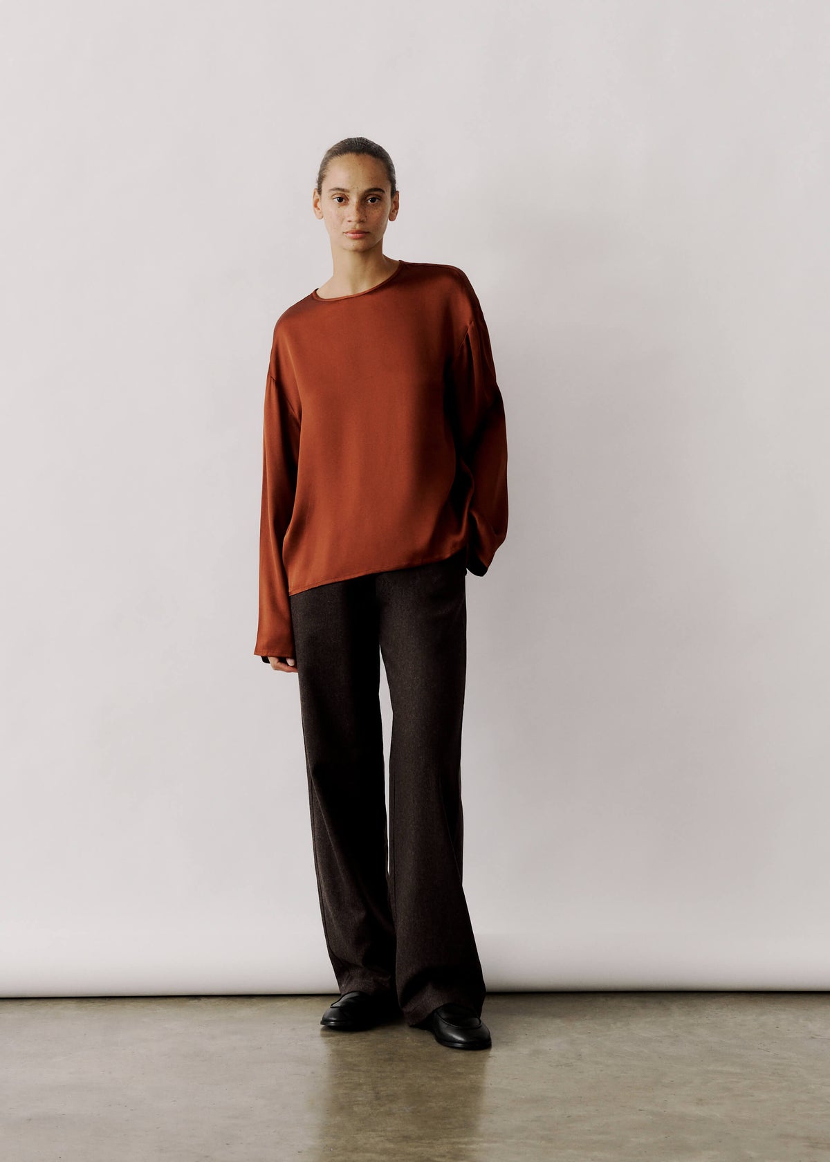
Place lustre on focal points to control visual weight. A glossy blouse, the front of a jacket, or a metallic trim will draw the eye, so pair them with matte pieces of equal or greater volume to ensure the shine does not overpower the silhouette. Match finish to shape: use lustre on streamlined, close-fitting forms where reflections emphasise clean lines, and reserve matte textures for fuller or more structured volumes, where they absorb light and ground the form. Check combinations under typical room lighting to observe how highlights alter perceived proportions.
Use lustre to delineate boundaries and shift proportion. Glossy trims at hems, lapels, or sleeve edges can make segments appear shorter or longer. Small high-lustre details, such as buttons or piping, read as highlights on broad matte surfaces, while large panels of lustre need counterbalance in structure or colour depth to avoid a top-heavy effect. Consider drape and movement: lustrous fabrics reveal folds and contours through specular highlights, so pair them with matte fabrics that hold their shape. Compare garments on a hanger and in motion to judge whether the finishes support the intended silhouette and proportion.

6. Layer lustrous pieces strategically for an understated, balanced sheen
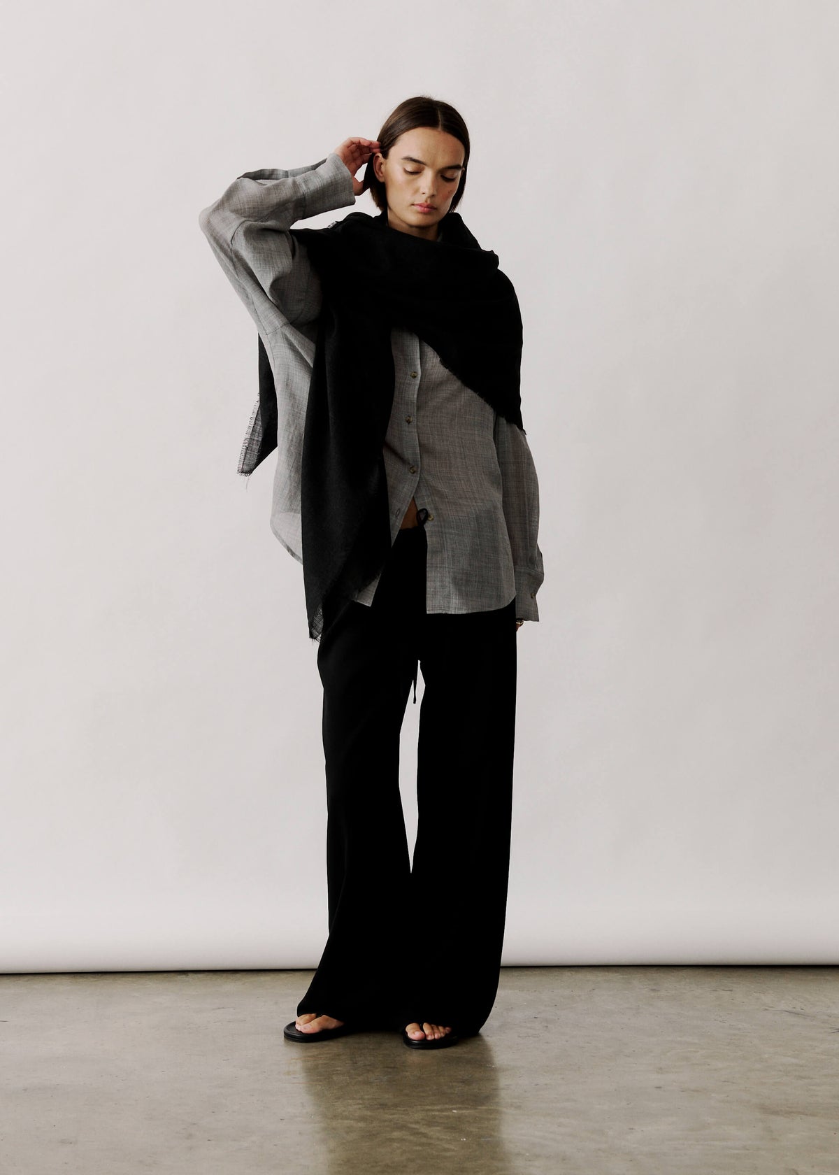
Begin with a matt base, introduce mid-sheen pieces, then finish each sightline with one to three high-lustre accents so the sheen reads deliberate, not overpowering. Position shiny items to draw the eye or to underscore architectural features, placing them opposite windows or beneath directional lamps so they catch and reflect light and help a compact room feel more spacious. Mind scale and texture: pair small glossy accessories with broad, matt surfaces, or choose a single large glossy piece within an otherwise restrained matt palette to prevent sheen from competing with pattern and to keep the composition legible. Repeat a finish in two or three locations, and vary levels of sheen within the same colour family, or combine polished metals with matt metal tones, to layer interest without introducing new colours.
Reserve high-lustre finishes for low-contact, wipeable areas, and use matt, textured materials on frequently used seating and surfaces; this reduces maintenance and makes the scheme feel intentional. Repeat finishes and consider scale so glossy elements read as considered focal points rather than competing details, guiding the eye and reinforcing architectural highlights. The result layers visual interest while acknowledging practical wear, producing a cohesive, easy-to-read composition.

7. Mix textures to create layered, understated depth
Matte finishes scatter and absorb light, while lustre reflects it. Hold sample swatches together beneath the room's light to observe how their contrast increases perceived depth. Choose a dominant matte backdrop and introduce lustrous accents on trims, cushions, and hardware to create focal points without overpowering the scheme. Repeat those lustrous touches in a few deliberate places to unify the composition and guide the eye.
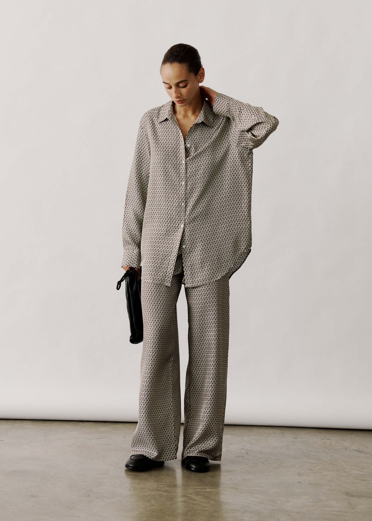
Keep large planes in a subtle, low-sheen finish and reserve higher-sheen, textured fabrics for smaller accents to prevent lustre from appearing excessive. That measured contrast guides the eye and maintains a composed surface while allowing discreet moments of shine. Pair smooth, reflective surfaces with napped or brushed fabrics so visual sheen aligns with a pleasing tactile contrast and invites interaction. Aim for consistent colour saturation across finishes, or ground the palette with a slightly deeper matte tone so lustre pieces catch the light and reveal gentle tonal variation.

8. Refine the finishing touches with accessories and footwear
Limit shine to one or two focal accessories. Small areas of lustre attract attention more effectively than broad matte surfaces, so keep shine deliberate and considered. Use matte footwear to anchor glossy garments: low-sheen shoes absorb light, create a stable visual base, and hide scuffs more effectively than polished finishes. Balance emphasis by pairing a lustre statement piece with matte accessories, or by repeating the same level of lustre across one or two items to distribute highlights and maintain cohesion.
Control where the eye lands by mixing texture and scale. Pair a small, high-shine piece with a larger matte coat so contrast between sheen and surface area guides attention. Test combinations in the lighting and while you move, because reflections, creases, and surface wear read very differently in bright light, low light, and motion. Observe how highlights shift and where creases form, then adjust the number or placement of lustre elements to restore balance. Simple swaps, such as selecting matte or brushed hardware instead of glossy, often temper perceived flashiness without altering the outfit’s intent.

9. Coordinate hair, make-up, and finishing touches for a polished look
Sheen directs attention. Glossy hair and dewy make-up amplify facial highlights, while matte clothing and accessories tend to recede. Pair a lustrous hair finish with matte fabrics to keep focus on the face, or choose matte hair with a lustrous garment to let the outfit take centre stage. From that logic emerge practical surface-contrast rules. Combine a satin lustre fabric with matte jewellery and a matte lip to avoid competing reflections. Or counterbalance metallic accessories with matte textiles and a semi-matte hairstyle to preserve visual hierarchy. Colour and skin undertone alter how finishes read, on camera and in person. Warm undertones harmonise with warm lustres and gold tones, while cool undertones sit better with pearlescent or silver finishes. Apply make-up sheen to emphasise, or mattify to subdue, exactly where you want the eye to land. Think of colour and finish as partners: plan finishes to absorb attention or to bounce it back, depending on the focal point you want to create.
Test the full look in the lighting you will be photographed in, and take photographs from several angles. Blot the T-zone, or apply a small dab of highlighter, to observe how sheen interacts with skin, hair, and fabric before making adjustments. For on-the-go control during events or shoots, carry blotting papers, a small pot of finishing powder, or a light finishing spray. Smooth frizz with a touch of serum to tame stray strands and add controlled gloss, and swap any reflective accessory that dominates in photographs. Tweak hair products, powders, or fabric choices until highlights fall where you intend, then repeat the quick test under different lights to confirm the balance holds.

10. Care for lustrous and matte fabrics to extend longevity
Check the care label, and separate lustre and matt pieces, as fibres and finishes respond differently to agitation, heat, and detergents. Hand-wash or choose a gentle machine cycle, turn items inside out, and protect delicate garments in a mesh bag to minimise abrasion. Use a pH-neutral, silk-safe detergent, and avoid fabric softener, which can coat fibres and dull their sheen. If you need an enzyme cleaner for protein stains, such as sweat or make-up, spot-test it on an inside seam before treating the visible area.
To preserve surface texture, keep heat and drying under control. Air-dry garments flat or hang them to dry, reshaping while damp to retain their form, and avoid high temperatures that can melt synthetic fibres or crush pile. Iron on the reverse or through a pressing cloth, and use steam sparingly to relax fibres without flattening the finish. Store and rotate pieces to minimise creasing, fading, and mildew: hang lustre garments on padded hangers, fold matte knits with acid-free tissue, and keep items in breathable covers. Tackle small faults early; mend pulls and secure loose seams, blot stains rather than rubbing, and consult a textile professional for wet cleaning or specialist restoration when finishes are delicate or garments are structured.
Lustre catches light and draws the eye, while matte finishes absorb light and stabilise scale. Pairing them deliberately adds depth and improves legibility without introducing extra colour. Reserve lustre for small focal details and use matte across larger planes to balance visual weight, reduce maintenance, and temper perceived colour saturation.
Run practical checks across fabrics, colour pairings, contrast, silhouette, layering, texture, accessories, styling, and care to see how combinations behave in the room and in motion. Swatch fabrics, photograph arrangements from several angles, and repeat a small number of lustre accents; these simple, repeatable steps make a scheme more legible and easier to maintain.

Leave a comment
This site is protected by hCaptcha and the hCaptcha Privacy Policy and Terms of Service apply.