
What are the 10 printed pieces every capsule wardrobe needs?
Finding it difficult to combine patterned pieces within a pared-back capsule wardrobe? By focusing on shared colourways, complementary scales and recurring motifs, a handful of patterns can yield countless cohesive outfits.
This post outlines essential principles for styling prints, covering purpose, colour palette, scale and contrast, complementary families, neutral anchors, fabric and texture, placement, mixing rules, layering formulas and care. Apply these guidelines to combine prints with confidence, maximise outfit possibilities and prolong the life of your favourite prints.

1. Clarify the purpose of print links in printed materials
Begin by naming clear functional goals for your prints, such as adding cohesion, introducing colour, creating focal points or expanding outfit possibilities. Assess each candidate print against those aims, then apply a simple colour-linking guideline: favour prints that combine two neutral tones with one or two accent colours, and repeat at least one of those colours in a separate garment or accessory to increase mix-and-match options. When pairing prints, manage scale and visual weight by combining a large-scale motif with a smaller-scale print or a plain piece, limit each outfit to two printed elements, and position the busier print away from areas you wish to de-emphasise.
Give each print a functional role within the capsule wardrobe: an anchor print for statement pieces, a bridge print in mid-layers to link tops and trousers, and a small-pattern accessory to provide subtle repetition. Try to include at least one print that can fulfil more than one role. Before committing, place your candidate prints beside the core neutrals and photograph several pairings to judge harmony from different angles and in varied light. Discard prints that clash with more than one core piece or that only work with a single outfit, as they reduce the capsule’s flexibility. These simple tests will reveal which prints genuinely expand outfit permutations and which are best left out.
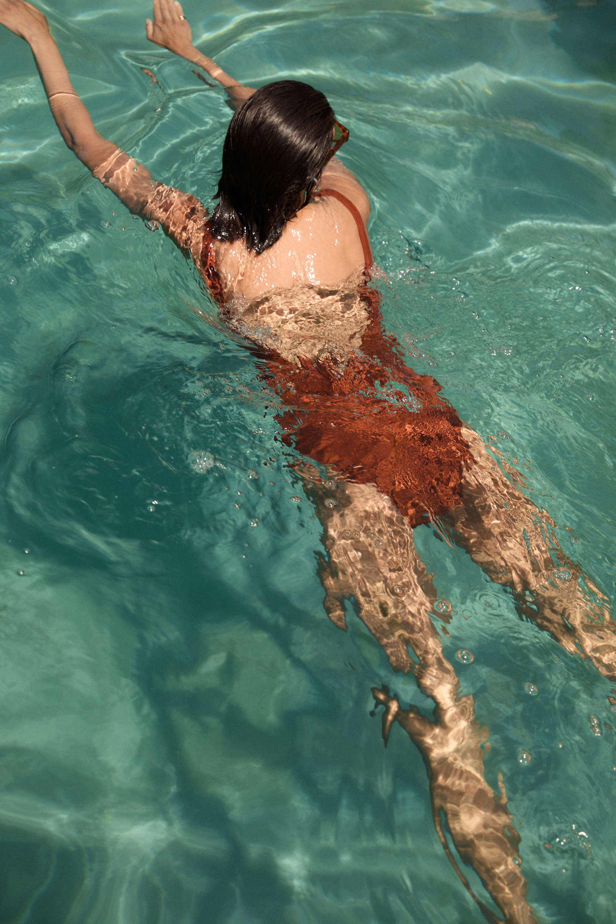
Let a colourful striped piece link your neutrals.

2. Develop a timeless, cohesive colour palette to unify your wardrobe
Begin by defining a considered core palette: choose two to three neutrals, one or two accent colours and a single print colour to act as a unifying thread. Neutrals provide a calm foundation, allowing a small edit of pieces to create many combinations. Make sure each print contains at least one core colour so a floral, stripe or spot will pair with the same trousers or jacket, offering cohesion without appearing overly matched. Match undertones rather than simply hue; favour mainly warm or mainly cool tones and assess fabrics in natural daylight or by photographing them. Warm leathers and gold finishes sit more naturally with warm tones, while silver and cool finishes complement cool tones.
Control value and saturation by pairing light, mid and dark tones to create contrast, and temper highly saturated prints with muted solids to avoid visual clashes and ensure ensembles remain discernible from afar. Build a swatch board and test combinations in person by pinning fabric samples together or arranging complete looks on camera to see how colours move and interact. Photographing in natural light will reveal undertone shifts and changes in saturation that flat swatches cannot show. Keep the pieces that consistently harmonise across looks, and refine the palette until most items interlock effortlessly.
Embrace printed silk that anchors neutral palettes.

3. Balancing scale and contrast to create visual harmony
Prints carry visual weight: large, high-contrast motifs draw the eye and form focal points, while small, low-contrast prints read as texture and help balance silhouette proportions. Use this principle when mixing prints by pairing one dominant motif with one subordinate motif; for example, a large floral with a tiny pin dot that shares at least one colour, so the combination reads cohesive rather than disjointed. Anchor printed pairings with a neutral or tonal solid layer, for instance a printed top, plain coat and printed skirt, allowing the solid to absorb visual clutter and keep the overall look calm and readable.
Think in proportions: pair prints with solids, or choose a dominant print with a supporting one, aiming for ratios such as 70/30 or 60/40 to guide where the eye rests. Shifting the split alters emphasis: more print above draws attention to the face, more below lengthens the leg line, while a balanced split keeps the silhouette even. Try a simple harmony test: step back and photograph the outfit from a few metres, viewing it as a thumbnail. If patterns blur into muddiness, change the scale, reduce colour saturation, or introduce a plain layer until the focal print reasserts itself. This practical routine helps you manage contrast and scale so combinations feel considered rather than accidental.
Anchor prints with a soft neutral top.

4. Choose harmonious print families to create a cohesive wardrobe look
Begin by selecting a cohesive colour palette of two or three hues that recur across prints so combinations feel intentional rather than accidental. Establish visual hierarchy by pairing different scales, for example a large motif such as a bold floral or wide check with a small-scale print like micro-dots or a fine stripe, so the eye has a clear focal point and patterns do not compete. Balance pattern density and rhythm by offsetting an airy, spare print with a denser, busier one, or by mixing precise geometric repeats with freer organic motifs to keep outfits legible and visually engaging.
Ground printed pieces with a textured neutral by adding at least one solid item in a tactile fabric or with considered tailoring to provide a calm visual pause and preserve contrast without introducing new colours. Begin modestly and test combinations, limiting yourself to two print families plus a neutral so you can judge interactions without visual clutter. Photograph pairings in natural light to see how scale and colour read on the body rather than on a hanger. Introduce a third accent print only when it consistently complements the others in scale, density and colour, helping to keep a capsule wardrobe cohesive and versatile.
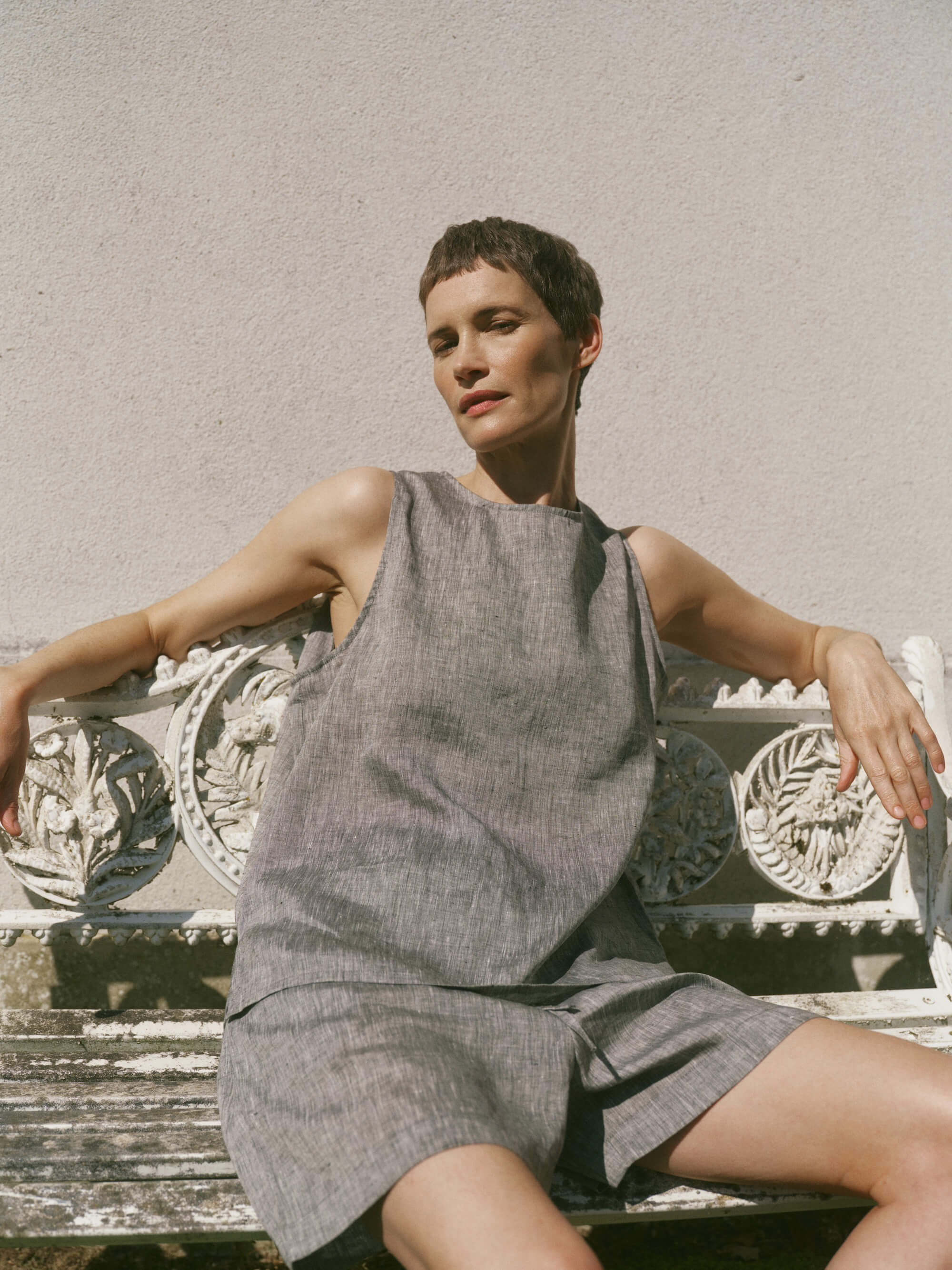
Anchor prints with a tactile sand linen top.
5. Anchor prints with versatile neutrals to create a refined, timeless palette
Select neutrals that share an undertone with the print. For example, pair warm florals with camel or stone and cool stripes with navy or slate, so seemingly different pieces read as a single, cohesive outfit. Control visual scale by combining a large, busy print with solid, streamlined pieces to anchor the eye, or counter a small ditsy print with textured neutrals such as a ribbed knit or matt denim to introduce depth without competing. Limit prints per outfit to one focal piece, or two when one is deliberately subtle, and position the print where you want attention to fall, for instance a skirt at the waist or a scarf close to the face, to shape proportion and balance. These small adjustments allow one printed item to serve across many looks while keeping each ensemble clear and considered.
Anchor a printed piece with a single structured neutral, such as a tailored blazer, classic trousers or a clean-lined coat. Structure gives a stable frame so the same print will suit different occasions. Use neutral textures and tonal layering to alter a print's mood: a cashmere jumper or leather jacket in matching neutrals will make the print feel polished, while washed denim or a slouchy knit will soften it. By switching just one neutral layer you can adapt a printed piece from smart to casual without changing the rest of your capsule wardrobe.
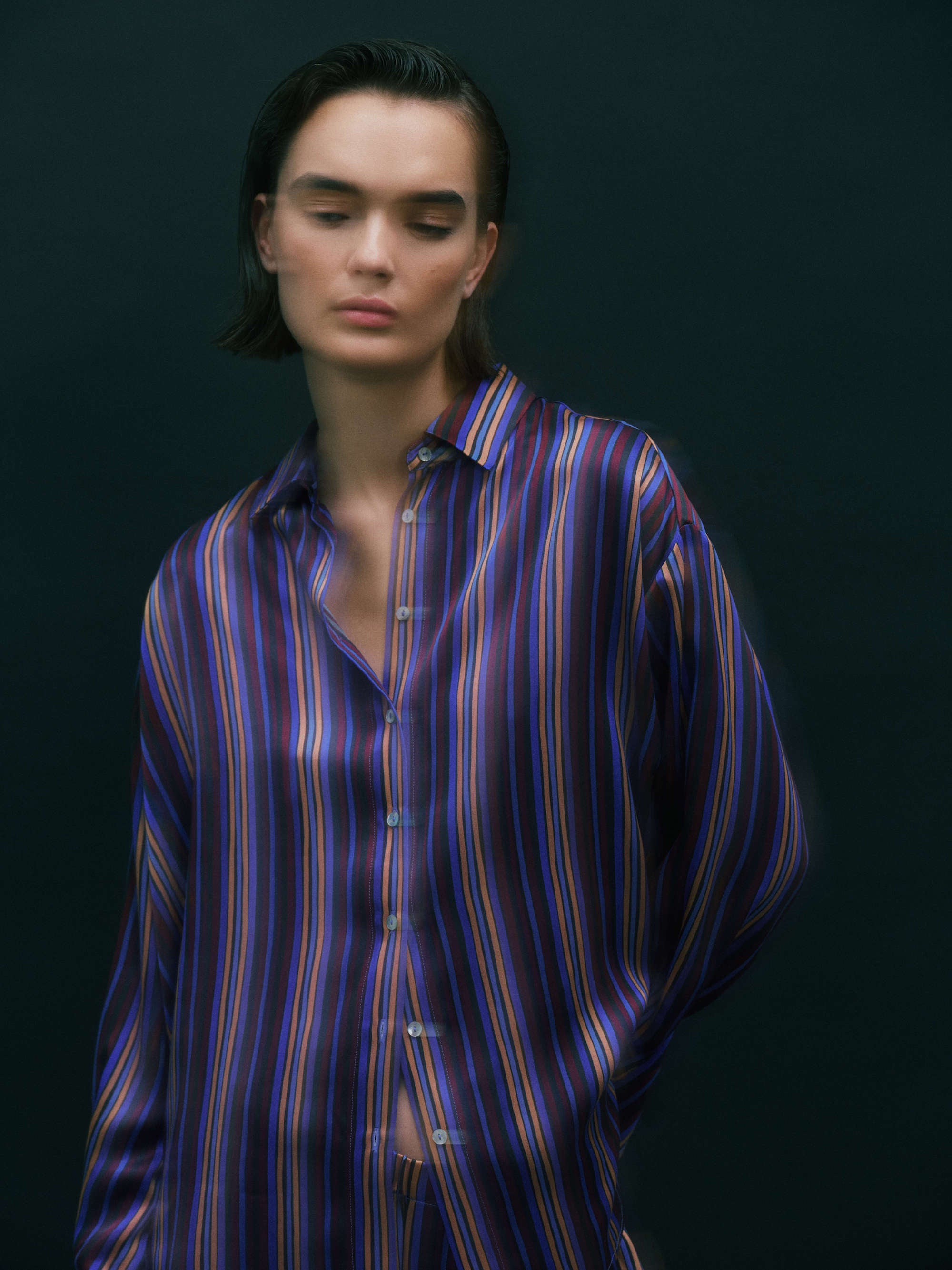
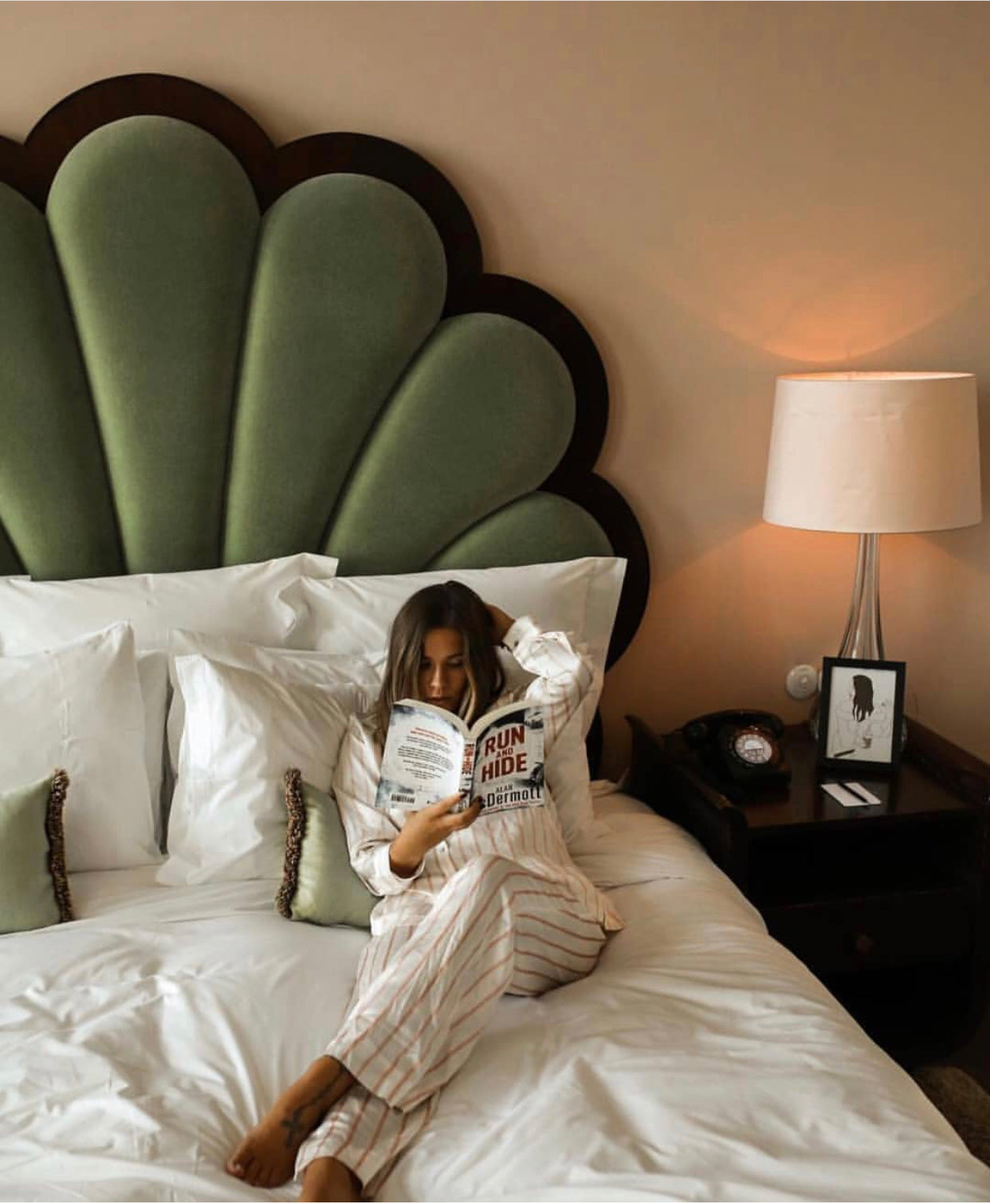
Make this striped dress your capsule’s single focal piece
6. Match fabric and texture to the season for effortless comfort
Pair fabric weight with print scale: lightweight, fluid fabrics favour small, delicate prints that sit in proportion, while heavier, more structured textiles suit larger, bolder motifs that enhance the silhouette without adding bulk. Introduce a textured solid such as a chunky knit, suede or ribbed jersey to create a visual pause between two prints, or to unite them by echoing a shared surface quality. Consider the fabric finish, as glossy or satin surfaces intensify colour and detail and can make small prints read busier; all-matte combinations feel more subtle and layered.
Select fibres with seasonality in mind. Breathable natural fibres such as linen and cotton preserve drape and clarity in warm-weather prints, while wool and brushed blends provide insulation and structure for cooler months. Plan layerable outfits so a printed base can sit beneath different outer fabrics, for example a printed blouse worn under a knitted vest or a tailored coat, allowing the same print to move between seasons without losing coherence. These approaches let you mix and match with confidence, maintaining comfort and ensuring prints remain readable across silhouettes and temperatures.
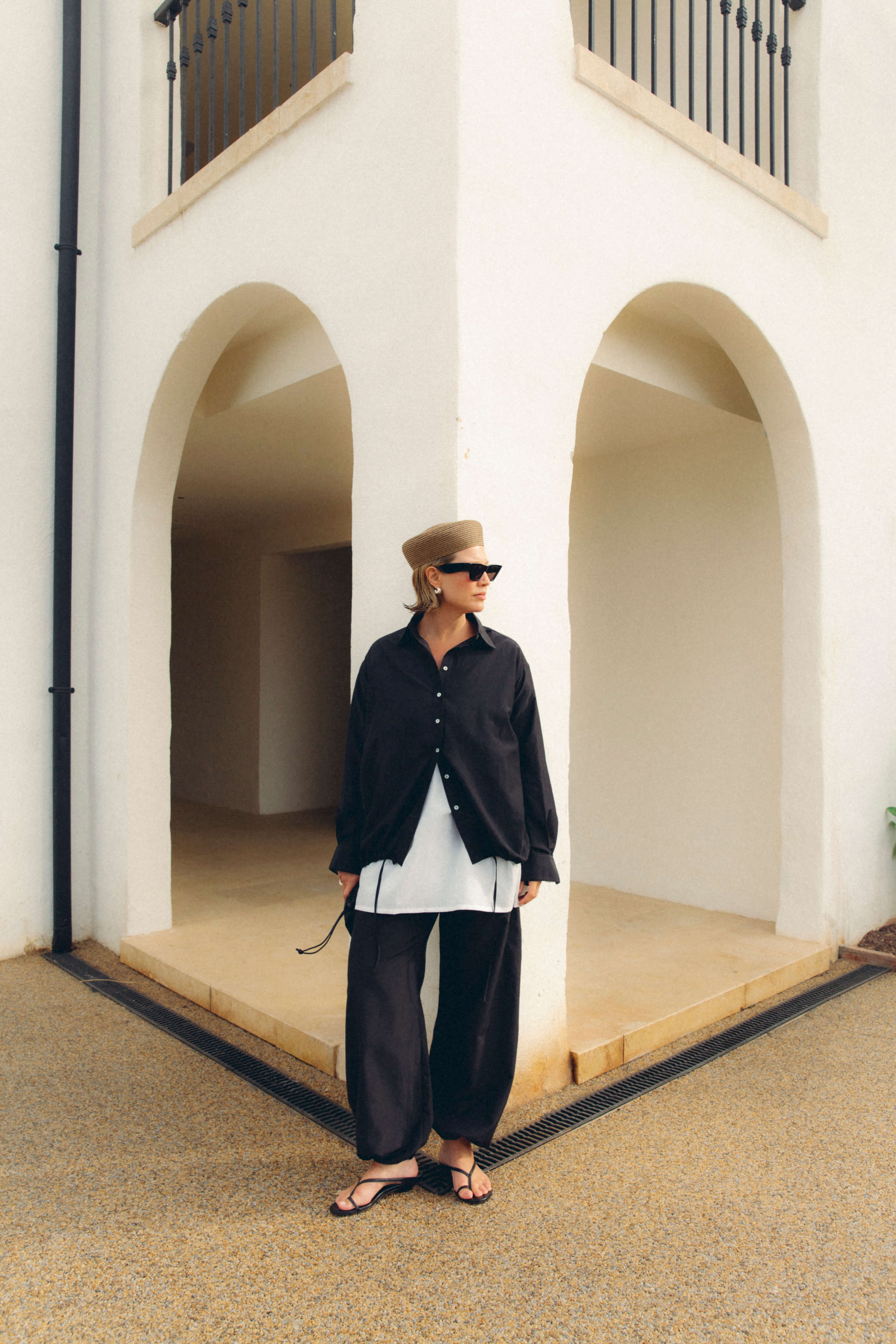
Adds fluid, breathable layering for warm-weather prints.

7. Position patterns to flatter proportions and enhance your silhouette
Choose pattern scale to complement body proportions: small, closely repeated prints minimise perceived volume on more delicate frames, while larger motifs provide a defined focal point to balance taller or broader silhouettes. Use line direction to guide the eye—vertical stripes or elongated motifs lengthen the torso, diagonal prints introduce gentle movement and soften broader areas, and horizontal bands broaden a narrow frame. Place high-contrast or brightly coloured patterns at intended focal points, such as the waist, shoulders or hem, and keep surrounding panels in low-contrast prints or solids to maintain balanced proportion.
When combining patterned pieces, favour one dominant, larger print paired with a smaller, subtler repeat that shares at least one colour to keep the ensemble cohesive. Consider fabric weight and construction: fluid materials soften pattern edges and can blur scale, while more structured weaves anchor motifs and preserve the intended lines. Align motifs with seams and darts to avoid unflattering breaks, and employ side panels or colour-blocking to create clean, slimming or lengthening lines. Position directional motifs to guide the eye, and keep pattern scale and colour consistent across pieces to maintain a clear, uninterrupted silhouette.
Use silk drape to soften pattern scale and flow.

8. Mix prints with effortless pairing rules
Select one dominant print and a complementary supporting print that share at least one colour to create cohesion while keeping contrast measured. Use scale to guide the eye: place larger motifs on skirts or coats and reserve finer, denser prints closer to the face where they read as texture and flatter the silhouette. Choose tonal, low-contrast pairings for subtle coordination, and higher-contrast combinations when you want a considered statement that lets each pattern read distinctly. Anchor the ensemble with a solid or a neutral textured piece, such as knitwear or denim, and keep supporting prints to smaller proportions to avoid visual clutter.
Let geometric patterns act as a foil to organic prints. Narrow stripes, fine checks and small polka dots will temper visual tension when kept finer than the organic motif. Limit an outfit to two prints, or three only if one is a small accessory, so the eye has a resting point and the bolder print remains dominant. Simple principles of a shared colour, considered scale, controlled contrast and a neutral anchor create mixable combinations that are effortless to recreate from a capsule wardrobe.
Anchor looks with a textured neutral layer.
9. Build versatile outfit formulas to master effortless layering
Begin with three dependable outfit formulas that keep prints legible and silhouettes clean: a fitted crew-neck T-shirt, a lightweight button-up shirt and a tailored coat; a slip dress, a fine roll-neck and a cropped knit; or a simple camisole, a soft sweatshirt and a classic trench. In each combination reserve bold prints to one or two layers so the eye reads a clear shape. Balance pattern scale by pairing a small motif with a larger print, and echo a colour from the pattern in a neutral layer to unify the look. Choose fabrics by function: breathable, body-hugging pieces at the base, insulating yet softly draping mid layers, and structured, wind-resistant outer garments. Assess stretch, drape and breathability to avoid bulk and overheating.
Shape and proportion can transform the same pieces. A slim base beneath an oversized coat lengthens the silhouette, while a cropped jumper over a midi dress defines the waist; tucks or half-tucks maintain form without adding bulk. Finish layered looks with purposeful accessories that solve practical problems and unify prints: a narrow belt to anchor multiple layers, a scarf to bridge colour or pattern, footwear chosen to match the outfit's scale, and the simple reveal of an underlayer by unbuttoning or rolling sleeves. Try combinations such as a narrow pinstripe shirt under a large floral skirt, cinched with a slim belt and worn with ankle boots; a polka-dot blouse beneath a checked blazer with a silk scarf that picks out a dot colour and loafers; or a slip dress layered over a thin roll-neck and cropped knit, cinched at the waist and paired with chunky boots. These small refinements keep prints legible, add warmth and function, and allow a capsule wardrobe to yield many balanced, wearable outfits.
Add an oversized cotton dress to anchor layered looks.

10. Mend and care for prints to preserve their vibrancy
Turn printed garments inside out and wash in cold water with a mild detergent on the gentlest machine cycle or by hand. Cold water helps reduce dye bleeding, and turning items inside out minimises abrasion; carry out a colourfastness test at an inconspicuous seam before laundering. Air dry away from direct sunlight, laid flat or on a hanger, and avoid tumble drying to prevent heat-related shrinkage and cracking of prints. When ironing, press on the reverse through a thin cloth at low heat to protect surface pigments and finishes. Store heavy knitwear folded and structured pieces on shaped hangers, use breathable storage and interleave delicate layers with acid-free tissue. Rotate similar garments regularly to distribute wear and reduce repeated friction on favourite prints.
Attend to small issues early to prolong a garment's life. Secure tiny tears with a fine needle and matching thread, trim and seal stray fibres, and reinforce stress points with a narrow zig-zag stitch or a lightweight patch behind printed areas to help preserve shape. Always carry out a discreet patch test before applying stain treatments or solvents, as aggressive agents can dissolve pigments or adhesive layers. Use targeted spot-cleaning for grease or ink stains rather than rewashing the whole piece to limit unnecessary exposure to water and chemicals. For irreplaceable or intricately printed garments, consult a professional textile cleaner or conservator for specialist advice and treatment.
A small selection of carefully chosen prints lets a capsule wardrobe produce numerous cohesive outfits by favouring shared colour threads, thoughtful scale and neutral anchors. Simple practical tests, such as photographing pairings in natural light, checking that undertones align and keeping combinations to one dominant print with a supporting motif, reveal which pieces genuinely broaden a wardrobe's versatility.
Use the following ten headings as a checklist: purpose, palette, scale and contrast, complementary families, neutrals, fabric and texture, placement, mixing rules, layering formulas and care. Refer to this list when curating or shopping to assess fit, seasonality and repairability. The outcome will be a compact, durable capsule wardrobe in which prints harmonise with clarity and longevity, offering repeated pleasure.

Leave a comment
This site is protected by hCaptcha and the hCaptcha Privacy Policy and Terms of Service apply.